One brand across physical, digital and real-time worlds
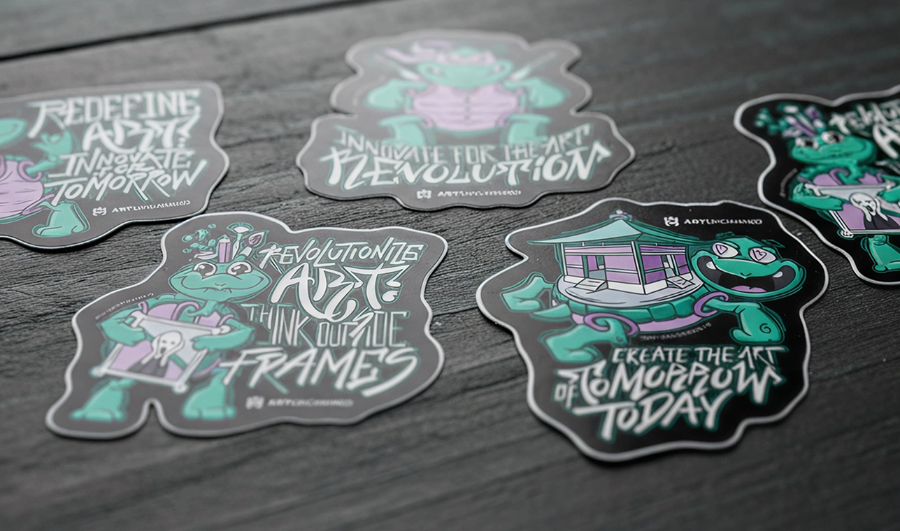
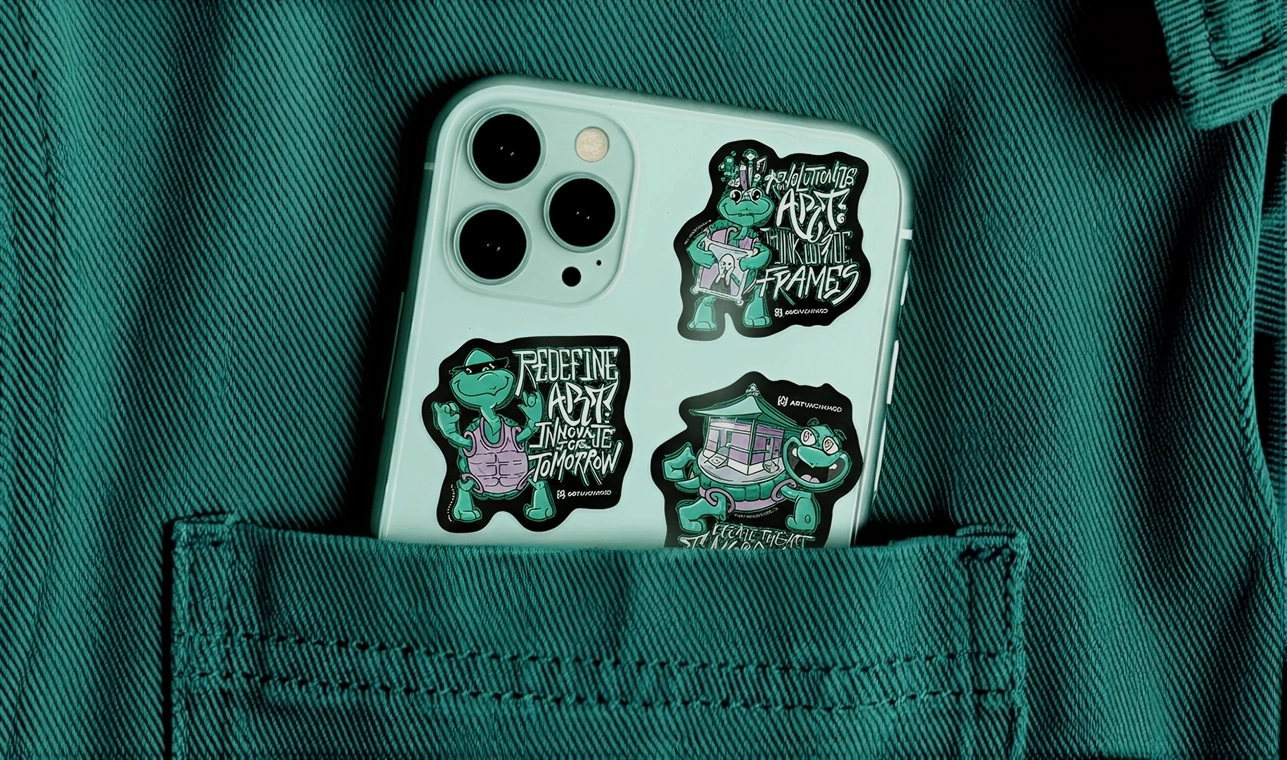
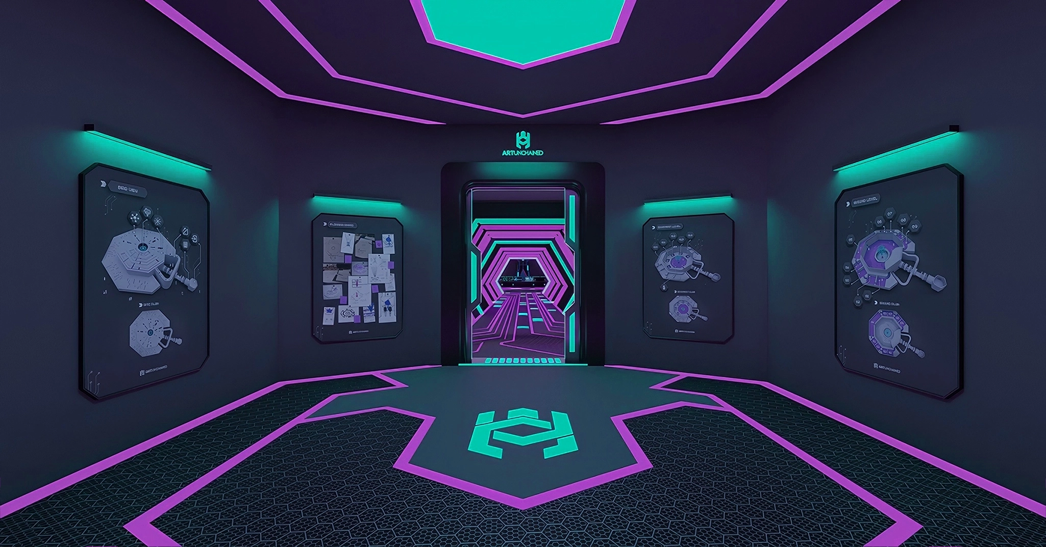
The studio creates art, architecture, objects and environments for virtual space. Its identity had to work as a mark, a website, printed communication, merchandise, a character and a live 3D presence. The challenge was not the number of outputs. It was preventing those outputs from becoming separate visual worlds.
I developed the project around one connected logic: precise enough to support a technology-led studio, open enough to retain the character of an art practice, and flexible enough to move between two-dimensional and three-dimensional space.
A 3D experience studio operating across art, architecture, metaverse environments and Web3.
Brand design, art direction, UX/UI, frontend implementation and 3D character development.
Create one recognisable identity across static, interactive and real-time environments.
Visual identity, website experience, communication system and a usable 3D mascot.
One studio, several realities
Art Unchained brings together fields often presented independently — art, architecture, technology and blockchain — and gives them new form in the metaverse. This mission became the foundation of the brand’s visual system, translating a shared idea across every layer of the design.
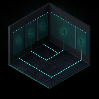
Creation
Reflects the brand’s ability to generate new spaces, architectures and environments.
Curation
Expresses the brand’s curatorial role in the ability to manage the perception of art in digital space.
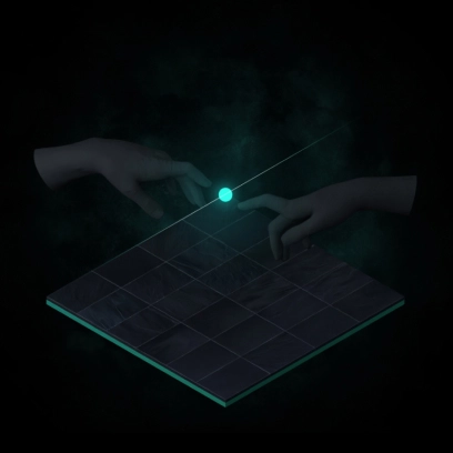
Connection
Represents the social layer which connects users and digital platforms in an ecosystem.
The symbol is a compressed brief
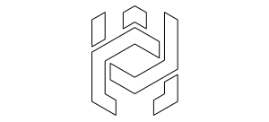
The Art Unchained mark combines three references. Each one carries a different part of the studio’s identity; none is expected to explain the entire brand alone.
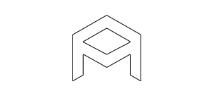
A-letter
Letter “A” representing creation and structural clarity. Designed as a precise architectural form, every line and angle follows proportion.
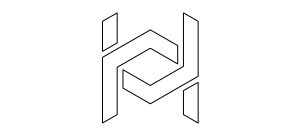
Chain
The chain reflects the brand’s technological foundation. Built on symmetry and modular rhythm, it embodies the logic of blockchain.
Turtle
The turtle is rooted in the client’s personal symbolism, reminding that true innovation respects time and persistence.
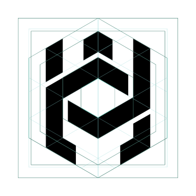
Geometry defines the system
The logo was constructed using a simple geometric relationship between a square and a hexagon. This combination provides both stability and flexibility, allowing the identity to expand without losing its visual consistency.
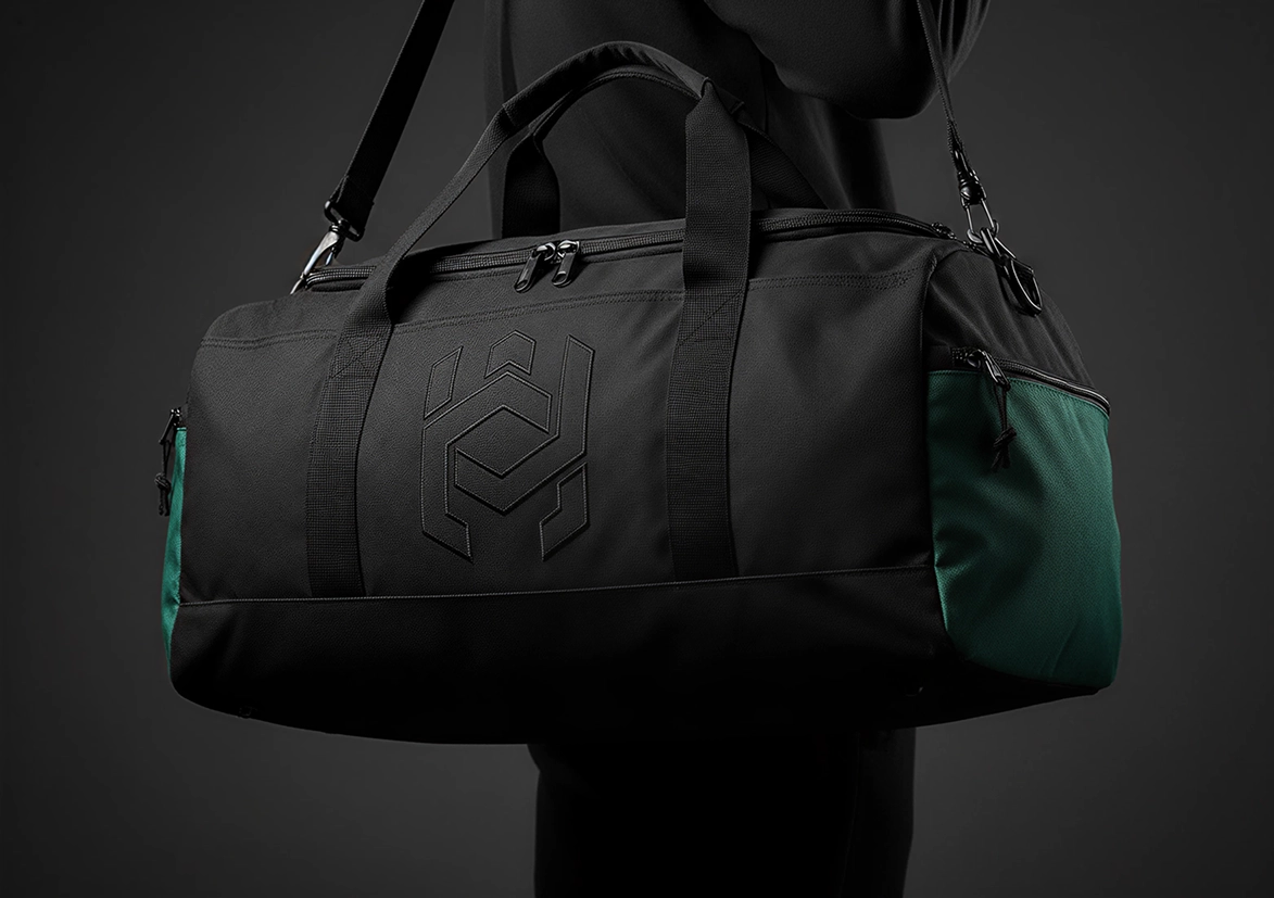
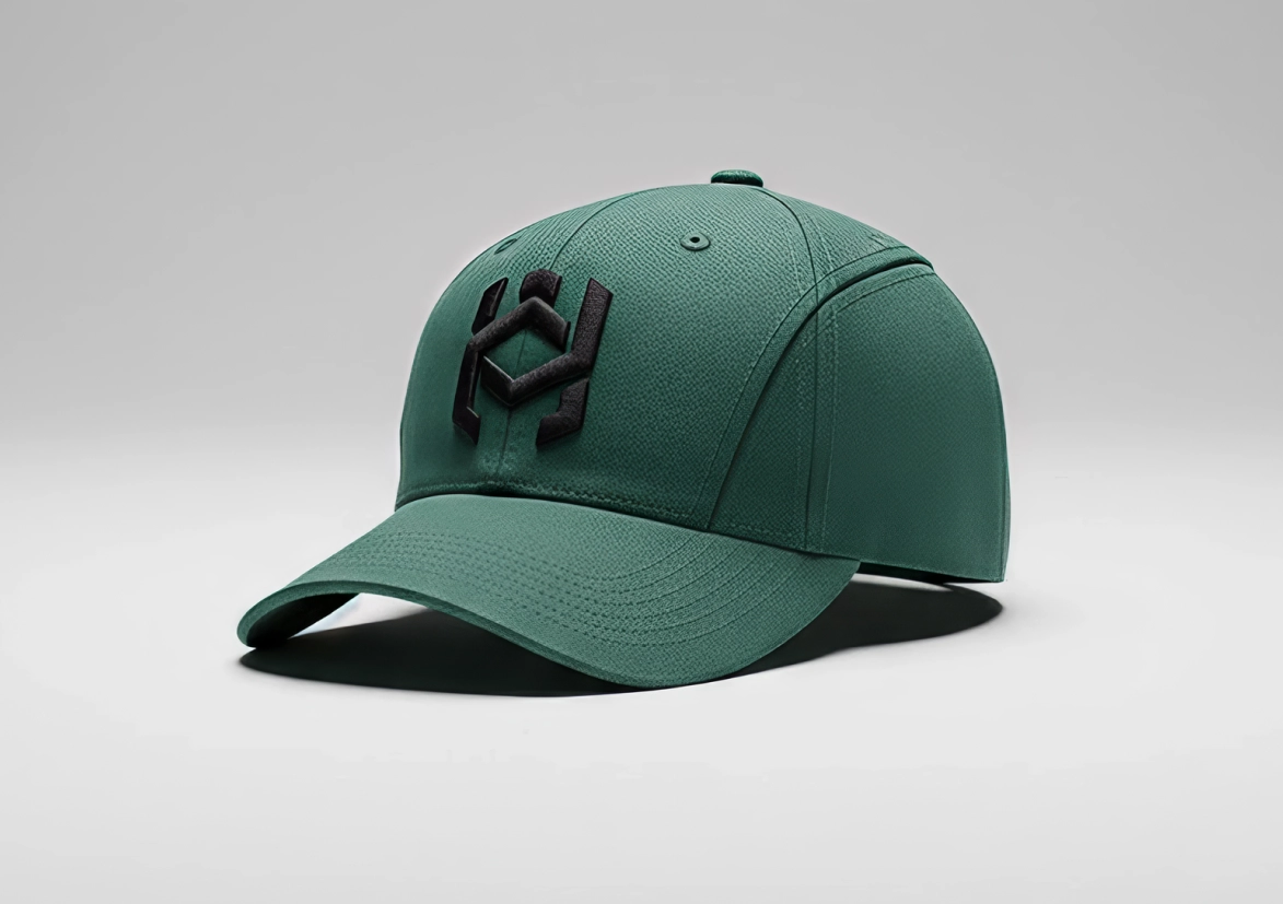
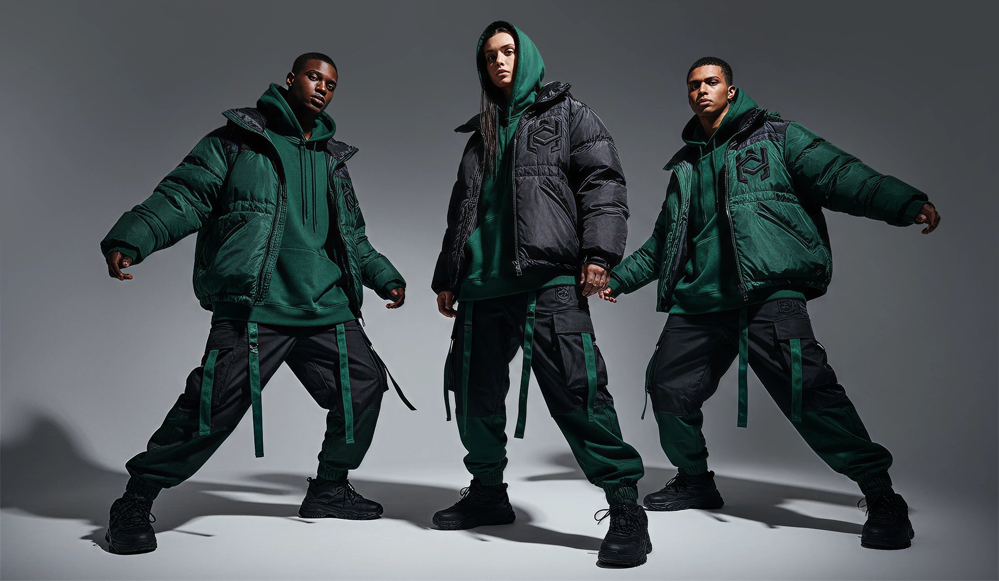
The same construction principles apply across every application, from interface elements and printed materials to merchandise and three-dimensional assets.
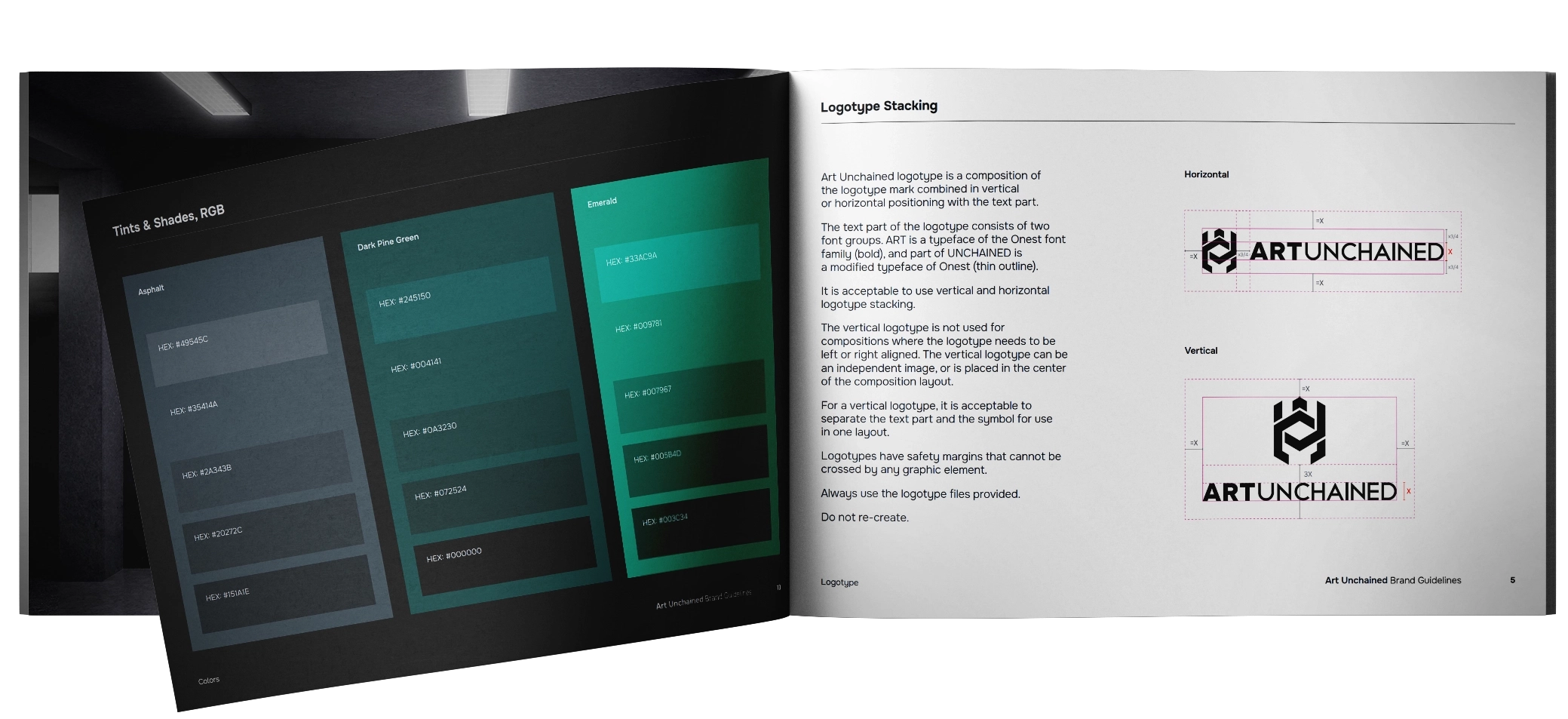
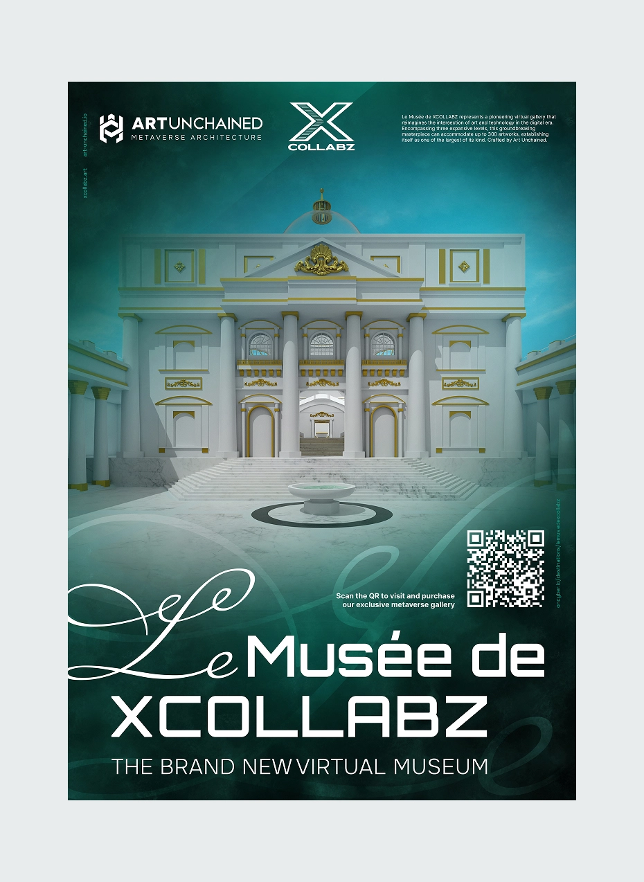
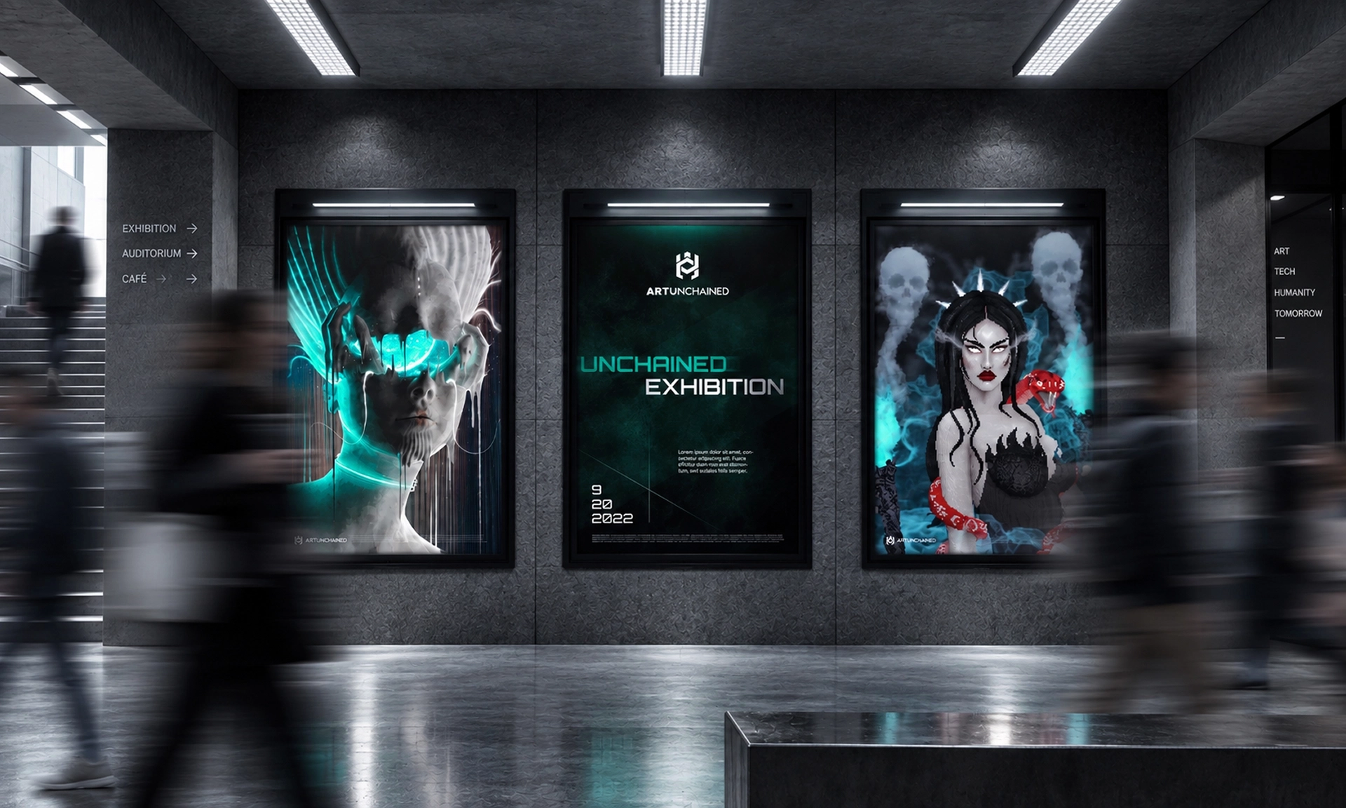
Website experience
The website was designed to help different audiences understand the studio quickly, whether they arrive as artists, partners or potential clients. Every page has a clear purpose, guiding visitors from the studio’s mission to its work and finally towards collaboration.
The interface stays intentionally restrained. Adaptive typography, a modular grid and balanced contrast create a consistent reading experience.

The mascot as a core brand asset
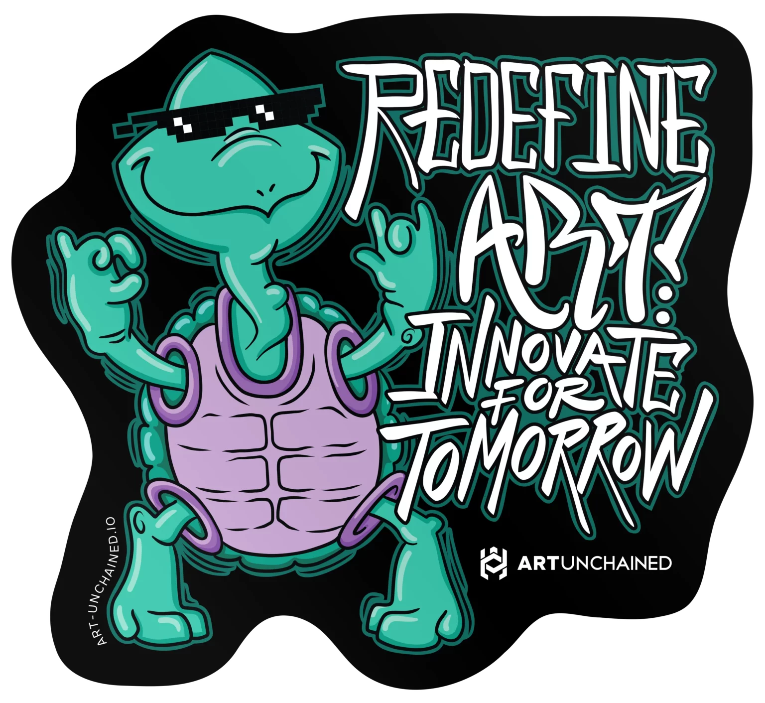
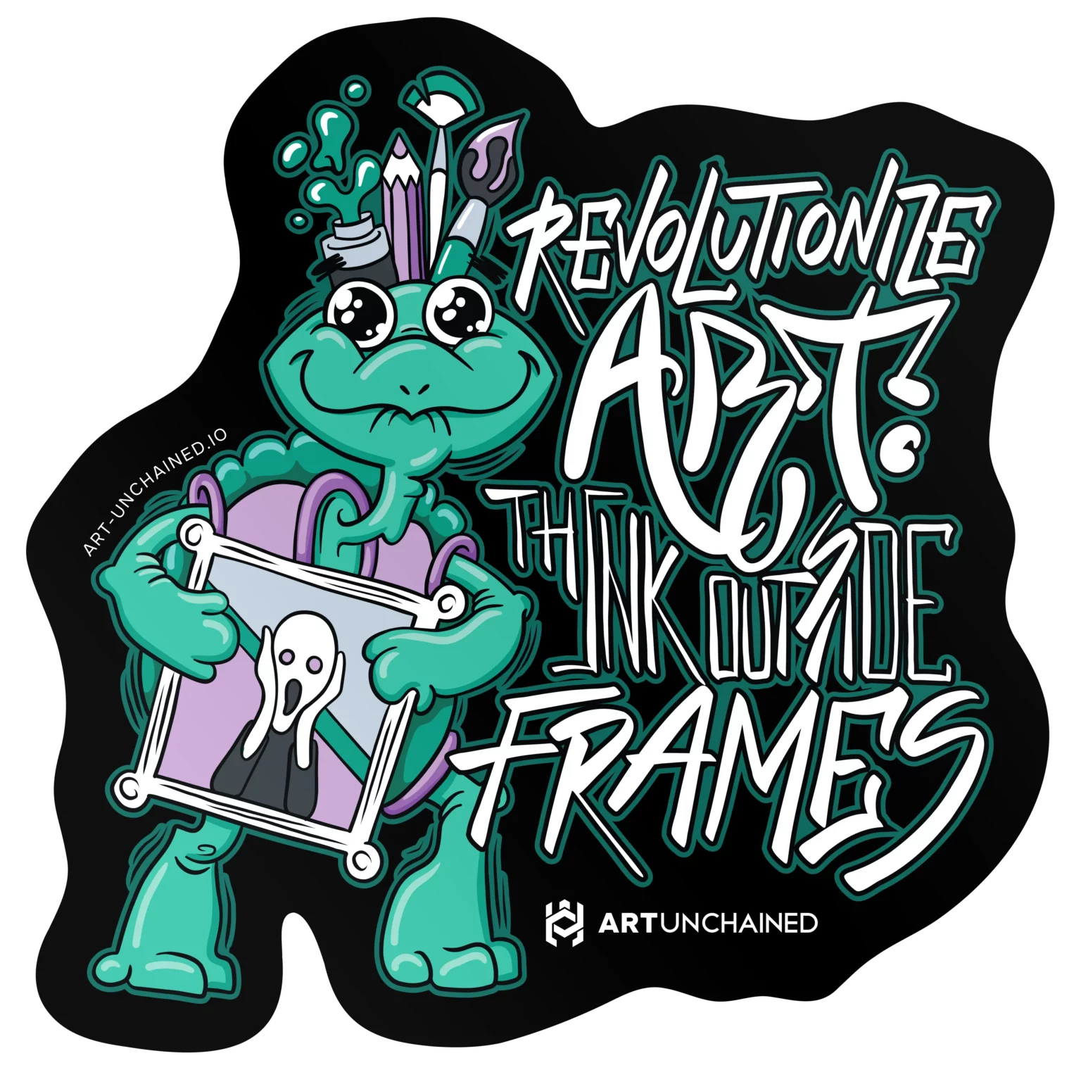
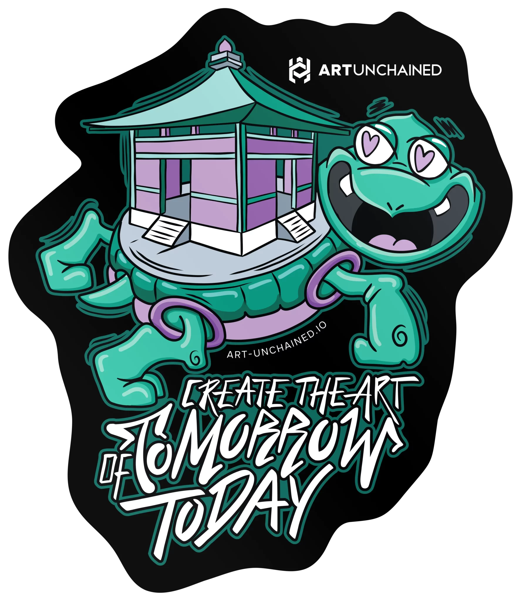
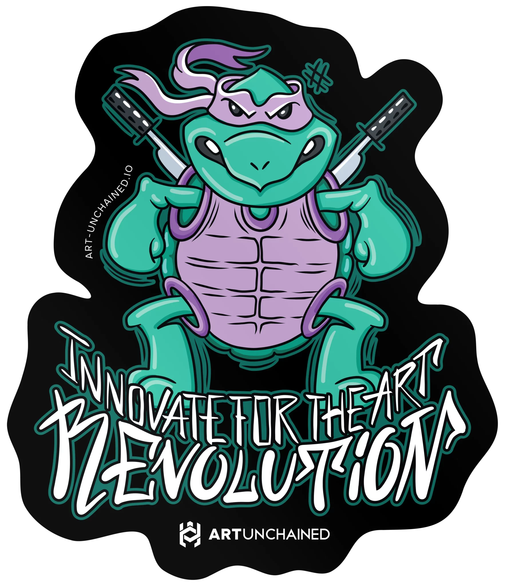
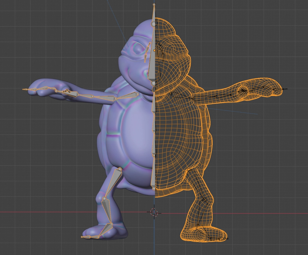
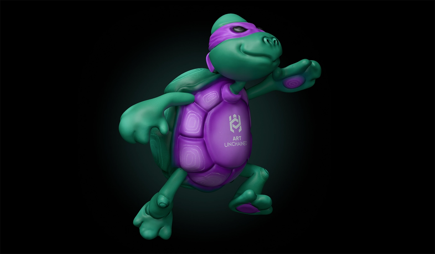
Arty was developed as a central part of the Art Unchained identity, giving the brand a recognisable personality across communication, animation and interactive experiences. The production included sculpting, retopology, rigging, UV mapping, hand-painted textures and WebGL optimisation.
Efficient geometry, controlled topology and adaptable materials ensured consistent movement and appearance across different formats, scenes and lighting conditions.
Identity
Establishes recognition through symbol, geometry, colour and proportion.
Communication
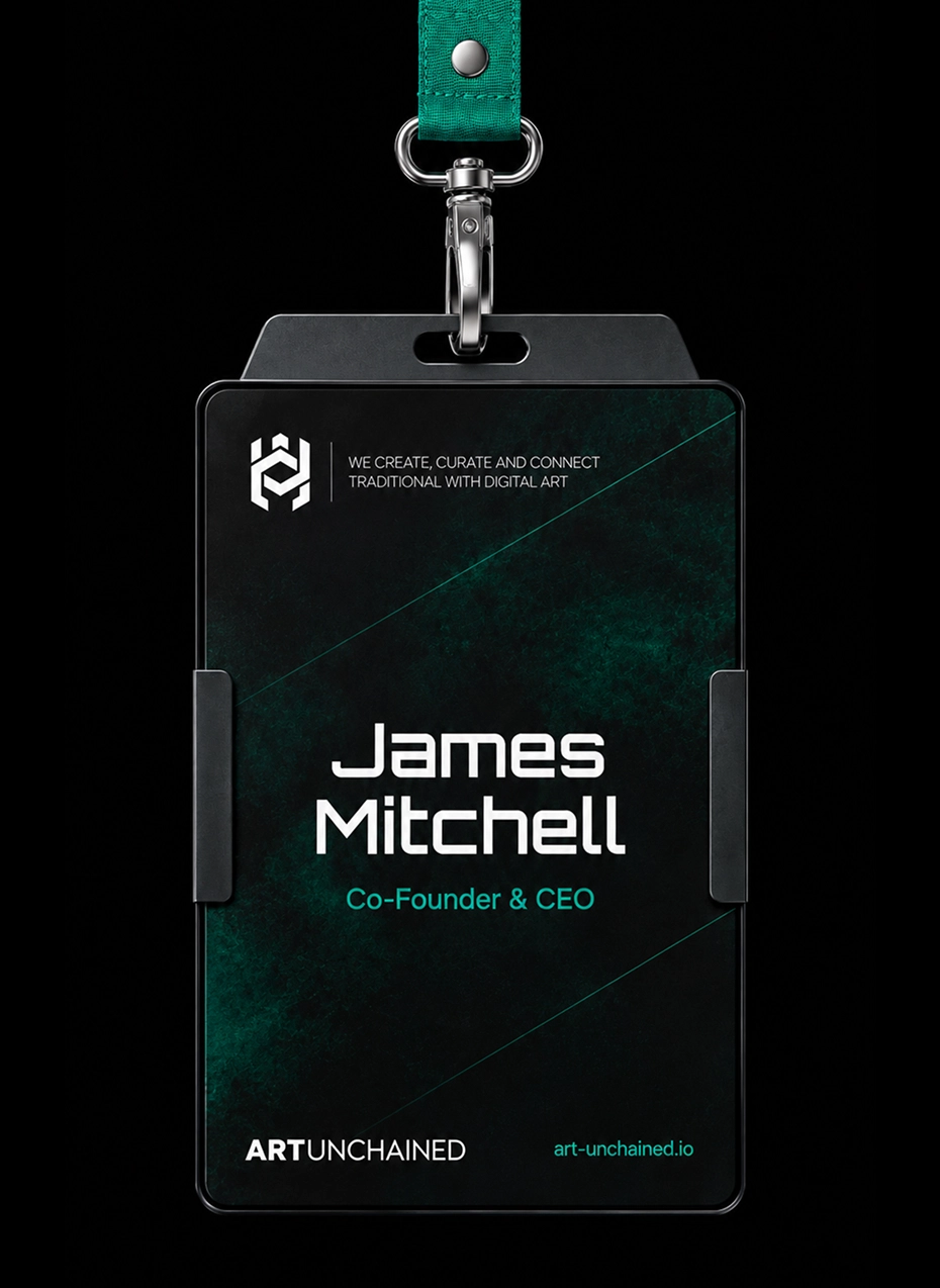
Translates the identity into guidelines, interface and merchandise.
Character
Adds voice, digital-life perception, humour and community presence.
Environment
Carries the identity into real-time space.