One visual system across seven businesses
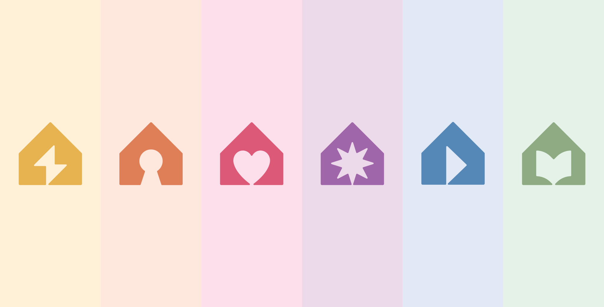
The holding was expanding across repair services, apartment exchange, retail, events, media and education. Designing every direction independently would have made each branch locally recognisable and the holding globally fragmented.
I built the family around one stable house silhouette and one variable counterform. The house establishes ownership. The internal sign explains the branch. Naming, typography and colour extend the relationship without asking every new business to invent a new identity from zero.
A holding spanning home services, interiors, retail, events, media and education.
Brand architecture, visual identity, modular logo system, UX/UI concept and brand guidelines.
Give every branch a distinct role while preserving immediate family recognition.
Parent brand, seven sub-brand identities, naming logic, colour and application systems.
Recognition through consistency
Home is the shared territory of every DMBT direction, but the role of home changes from branch to branch. It can mean an urgent repair, a move, an object, an event, a course or a story being filmed.
The house silhouette became the stable boundary of the system. Inside it, one minimal counterform changes according to the function of the branch.
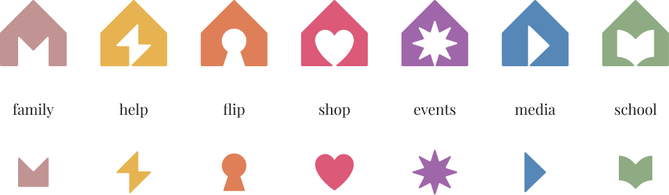

The distinction is deliberately economical. A sub-brand does not need a new visual language to feel specific. It needs one meaningful difference placed inside a structure the audience already recognises.
The name participates in the system
The sub-brand names follow the logic of digital domains, with the house mark replacing the conventional dot between DMBT and each functional extension. It acts as both a structural connector and a compact signal of the parent brand, integrating the identity directly into every name.
Colour palette
The system moves beyond the neutral restraint common in property and construction branding. Each sub-brand can shift between lighter and darker tones to create its own atmosphere while remaining part of the wider visual system.



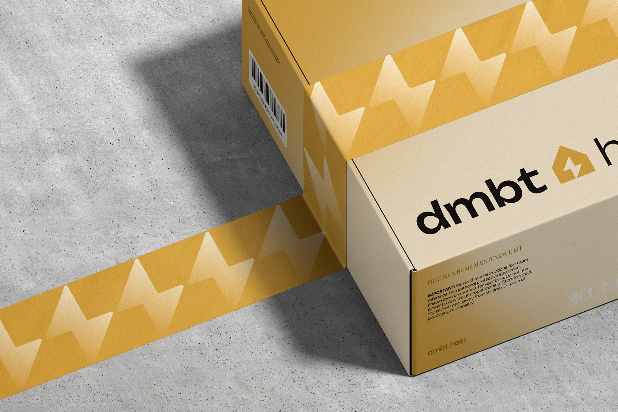
This was the most energetic sub-brand — focused on quick repair services. I built its identity around a feeling of instant action. The logo keeps the dmbt house shape but introduces a lightning bolt as the counterform, a symbol of fast, reliable help.


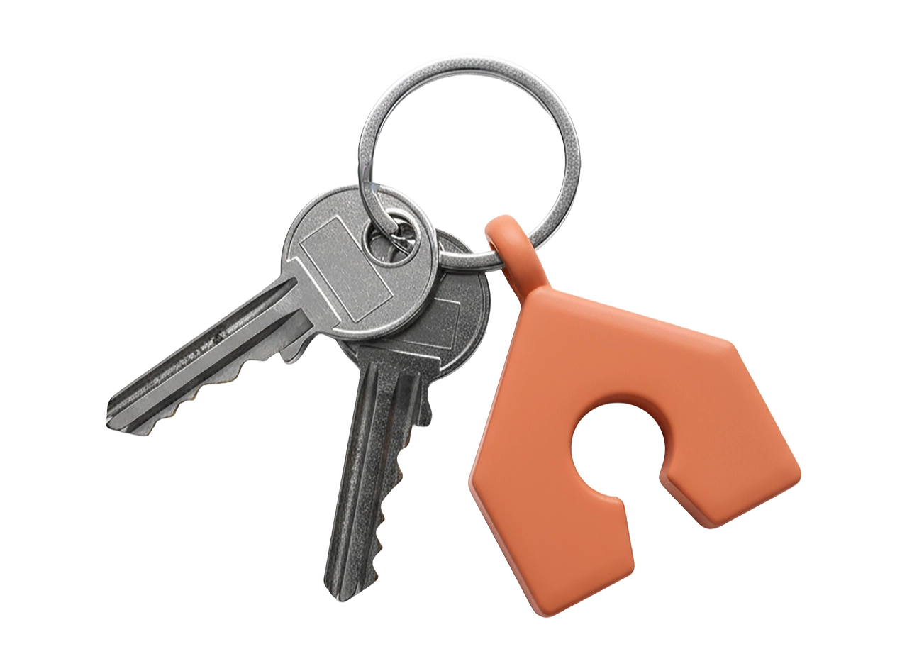
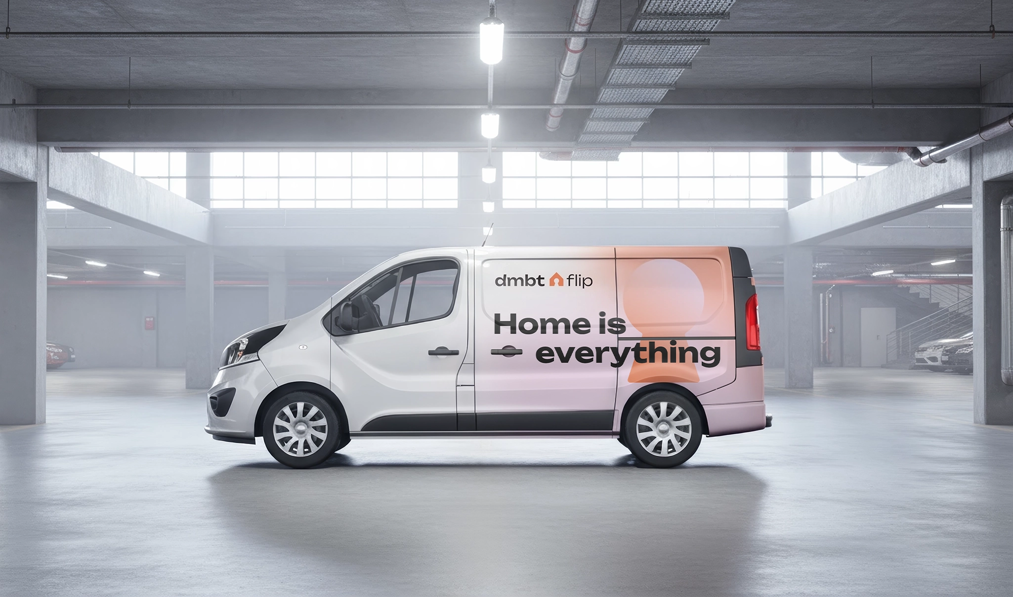
Dmbt.flip handles apartment exchanges, helping clients transition between homes. I used the same house silhouette, but the counterform became a lockwell keyhole — representing access and personal guidance.


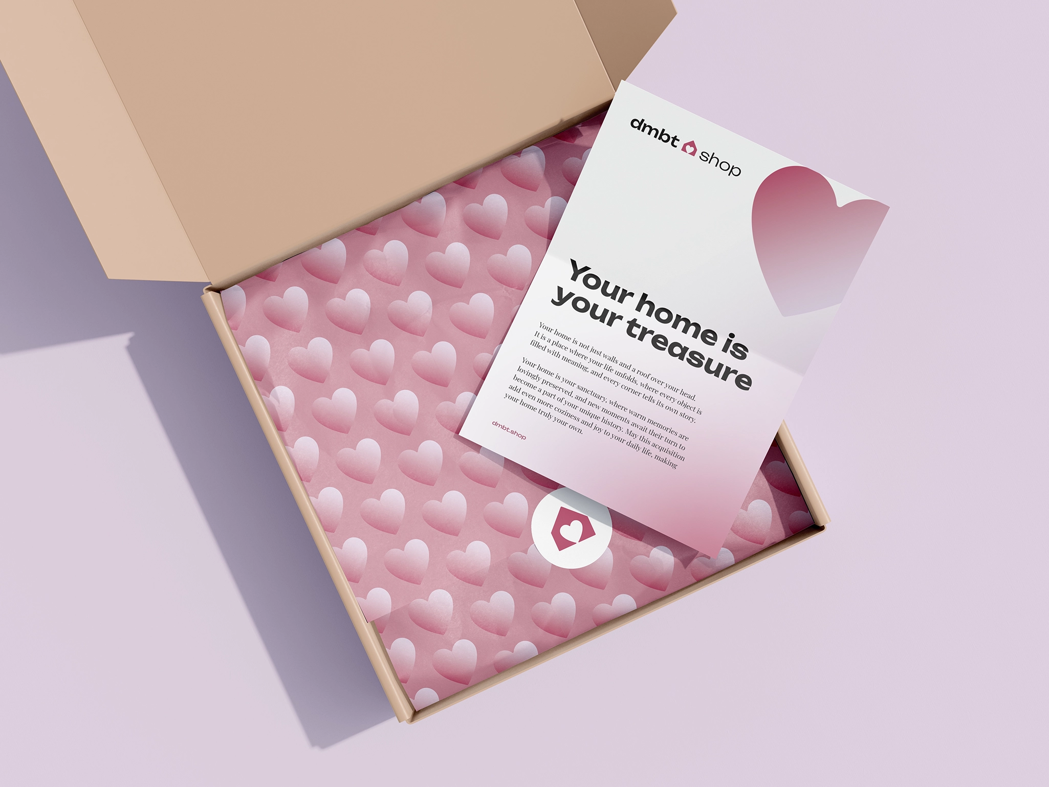
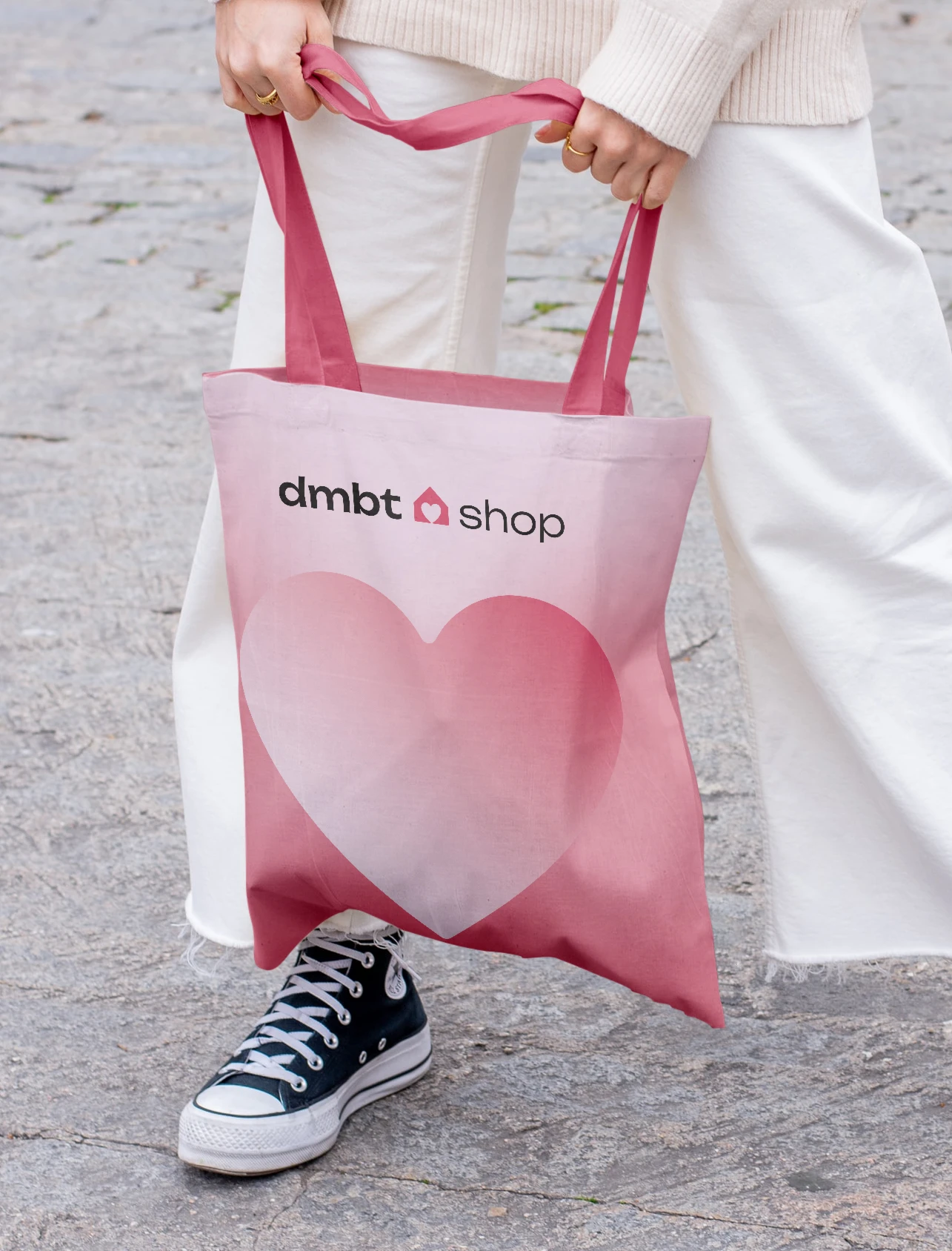
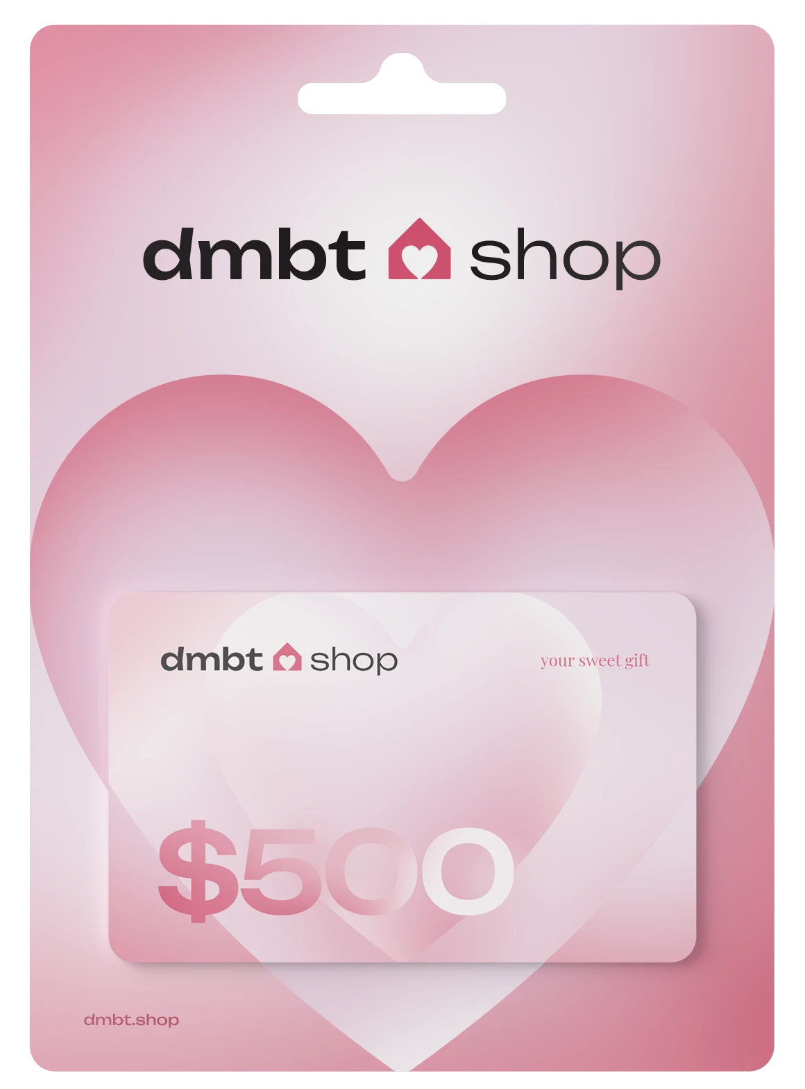
Dmbt.shop sells home decor items and small interior details made by the holding. The logo needed a softer, emotional tone, something that felt designed with care. I chose a heart as the counterform.


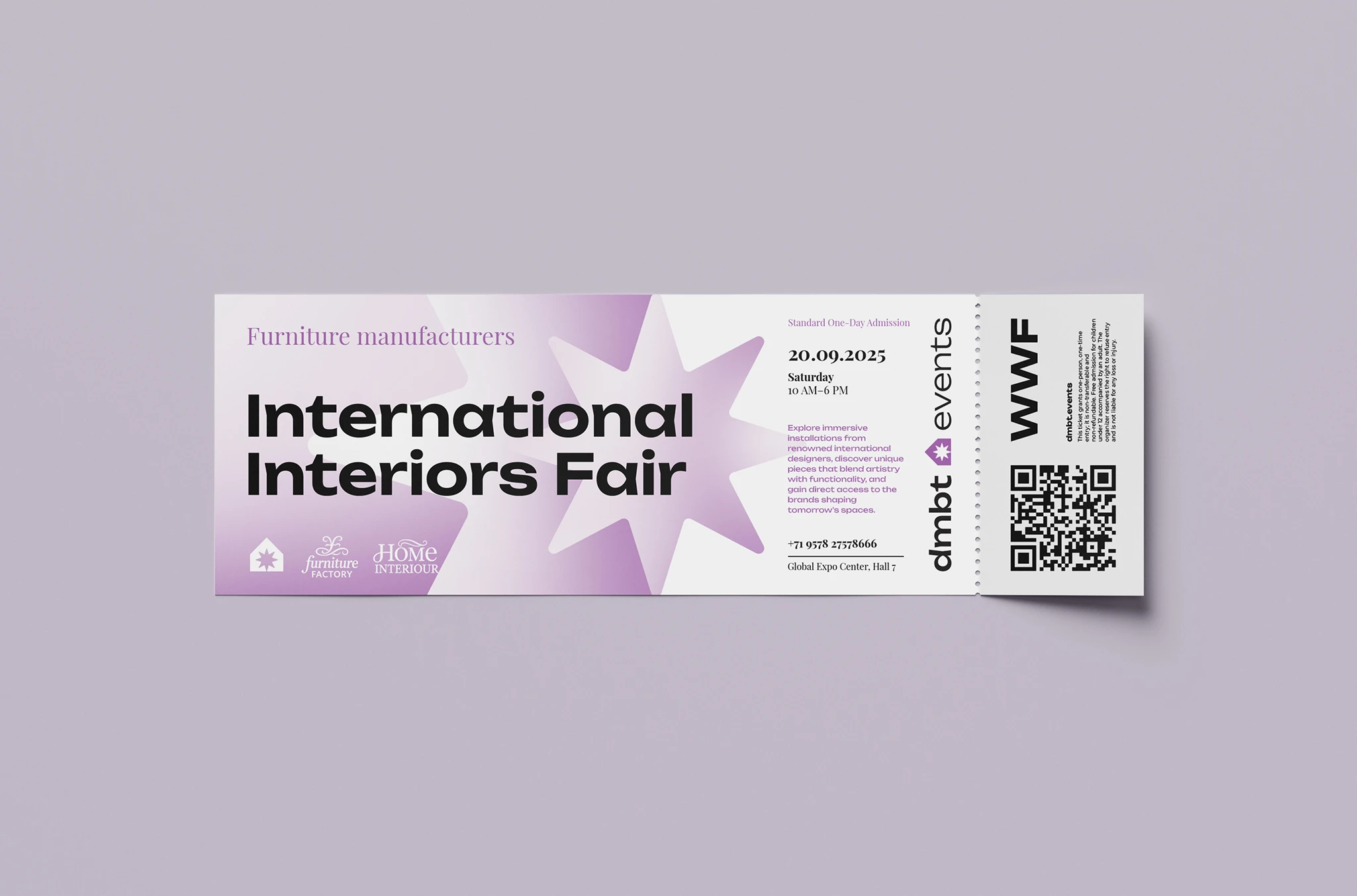
DMBT Events organises exhibitions and conferences for the interior and construction industries. The branch needed energy and a sense of occasion, but the holding did not need a second visual world built around spectacle.


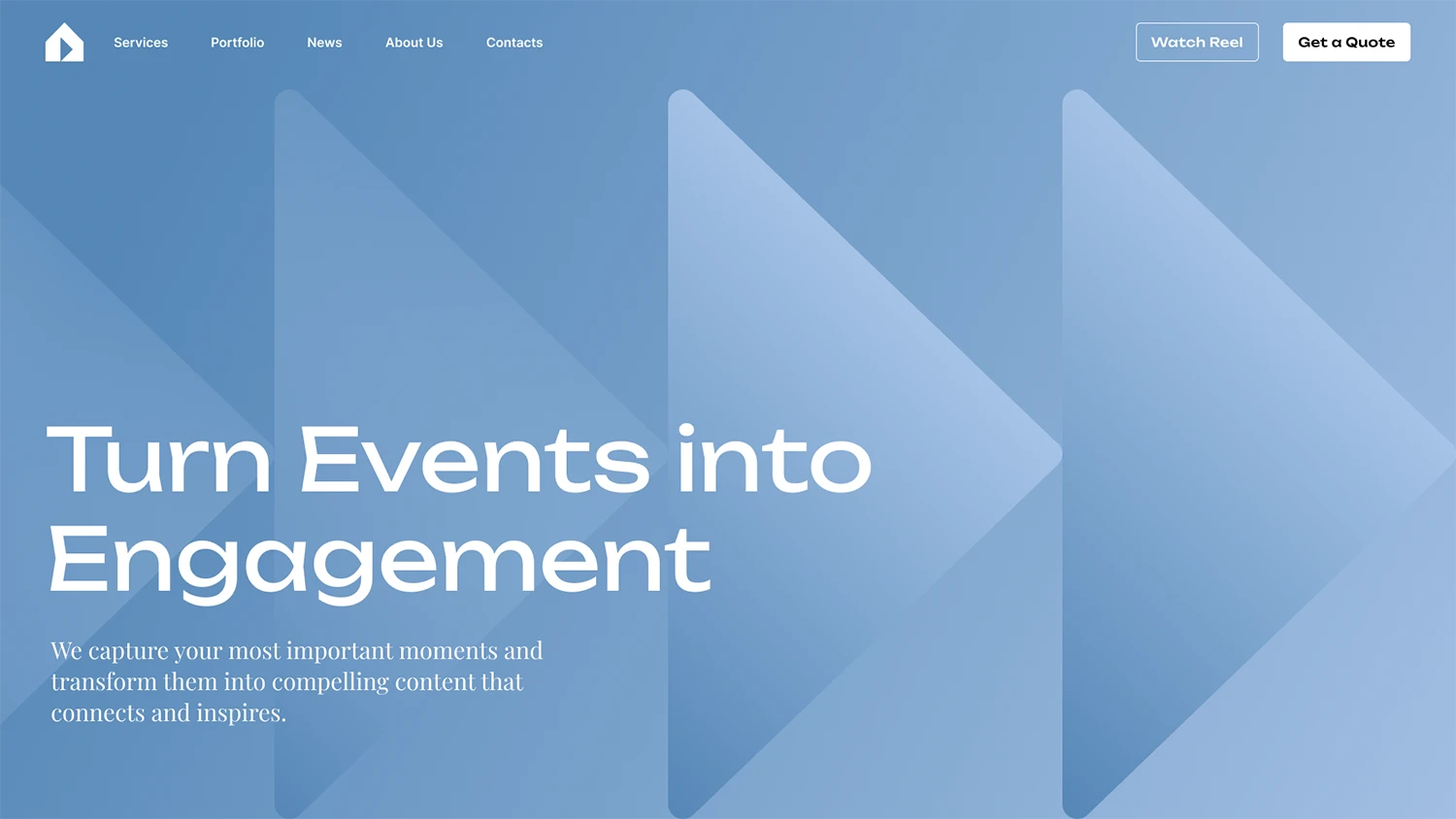
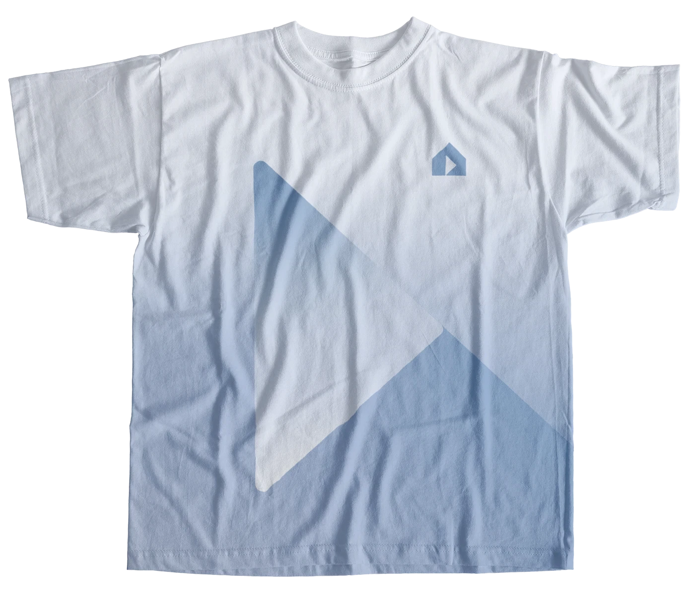
This branch handles all the holding's internal and external communication — filming, editing and promotion across every dmbt direction. I built its logo around the same core house form, but the counterform is the simplest and most universal symbol of media: the classic "play" sign.
The website prototype was designed as a simple, internal platform within the brand's ecosystem: a space to explore, watch and connect. A clean, functional environment that reflects the clarity and precision of the dmbt visual system.
Since dmbt.media also operates externally — with crews, videographers and production teams working on-site — I developed a simple branded merch line. The idea was to make the team recognisable at a glance, to keep the dmbt identity present both on-screen and in the field.


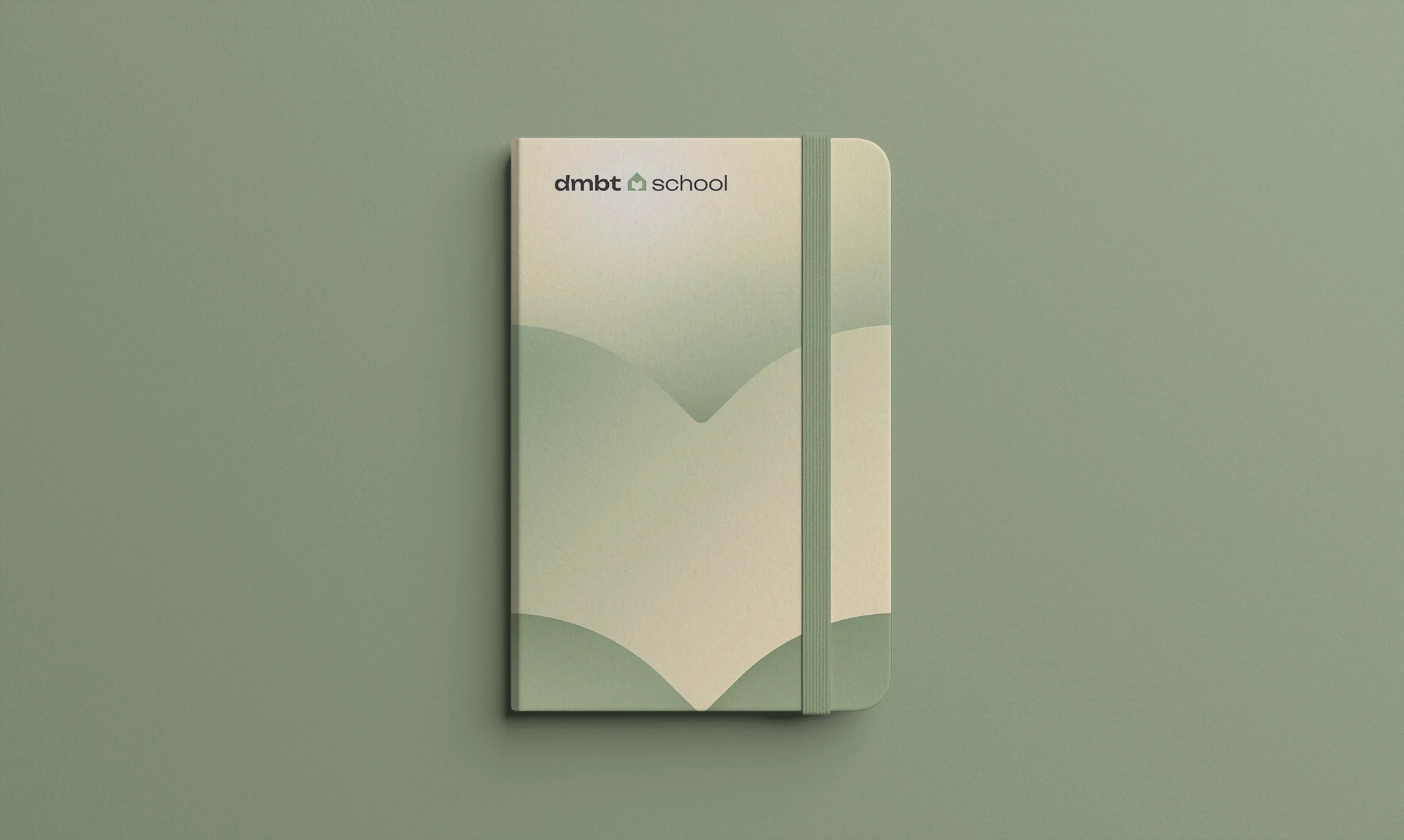
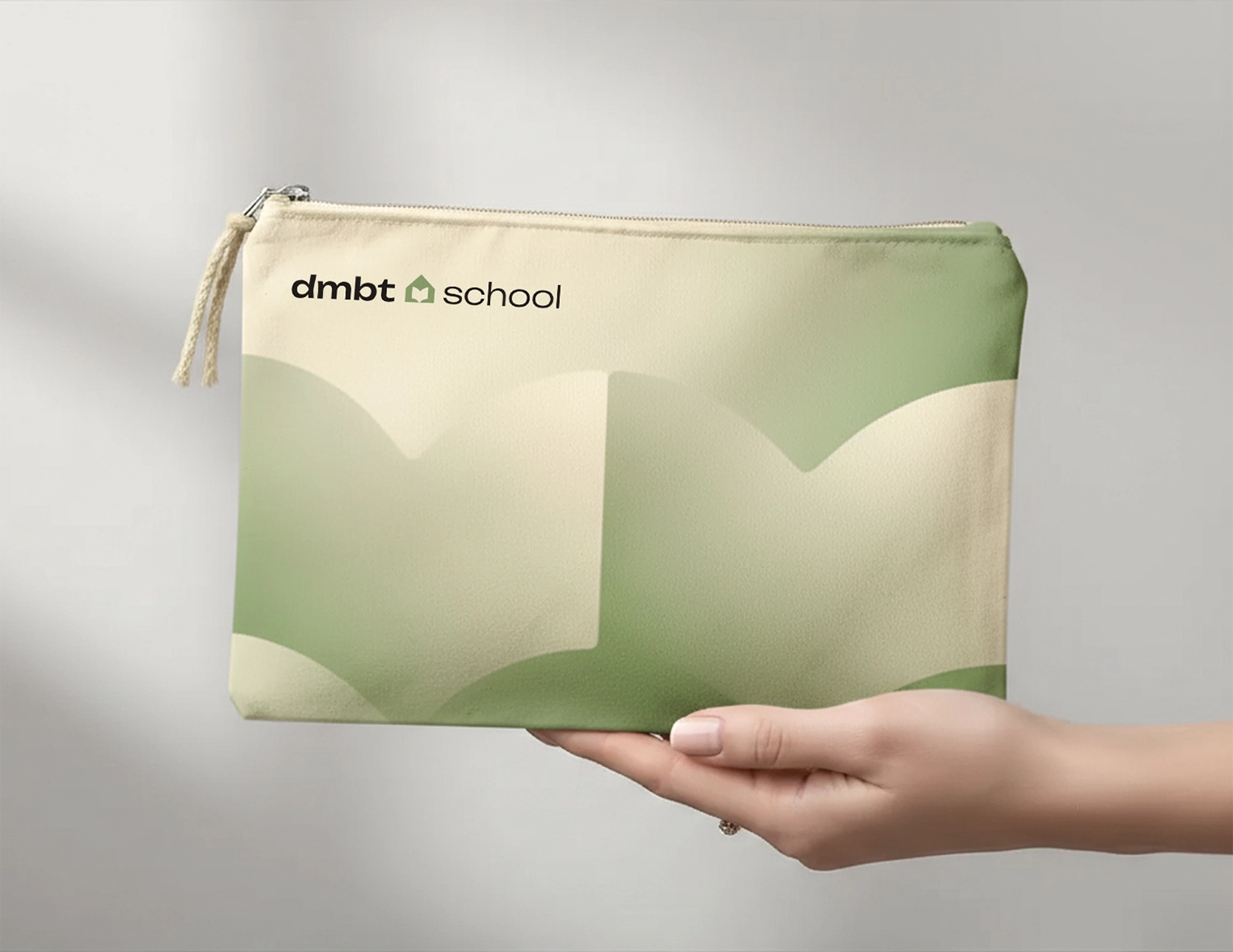
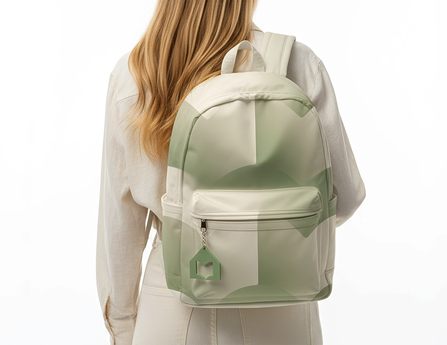
The educational branch — focused on courses in interior design, renovation and small architectural forms. The logo's counterform takes the shape of an open book — a direct symbol of learning, growth and shared knowledge.


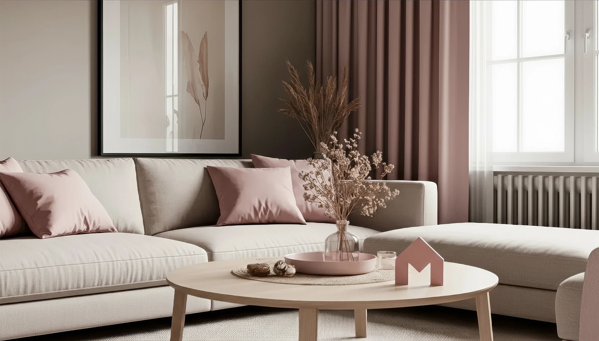
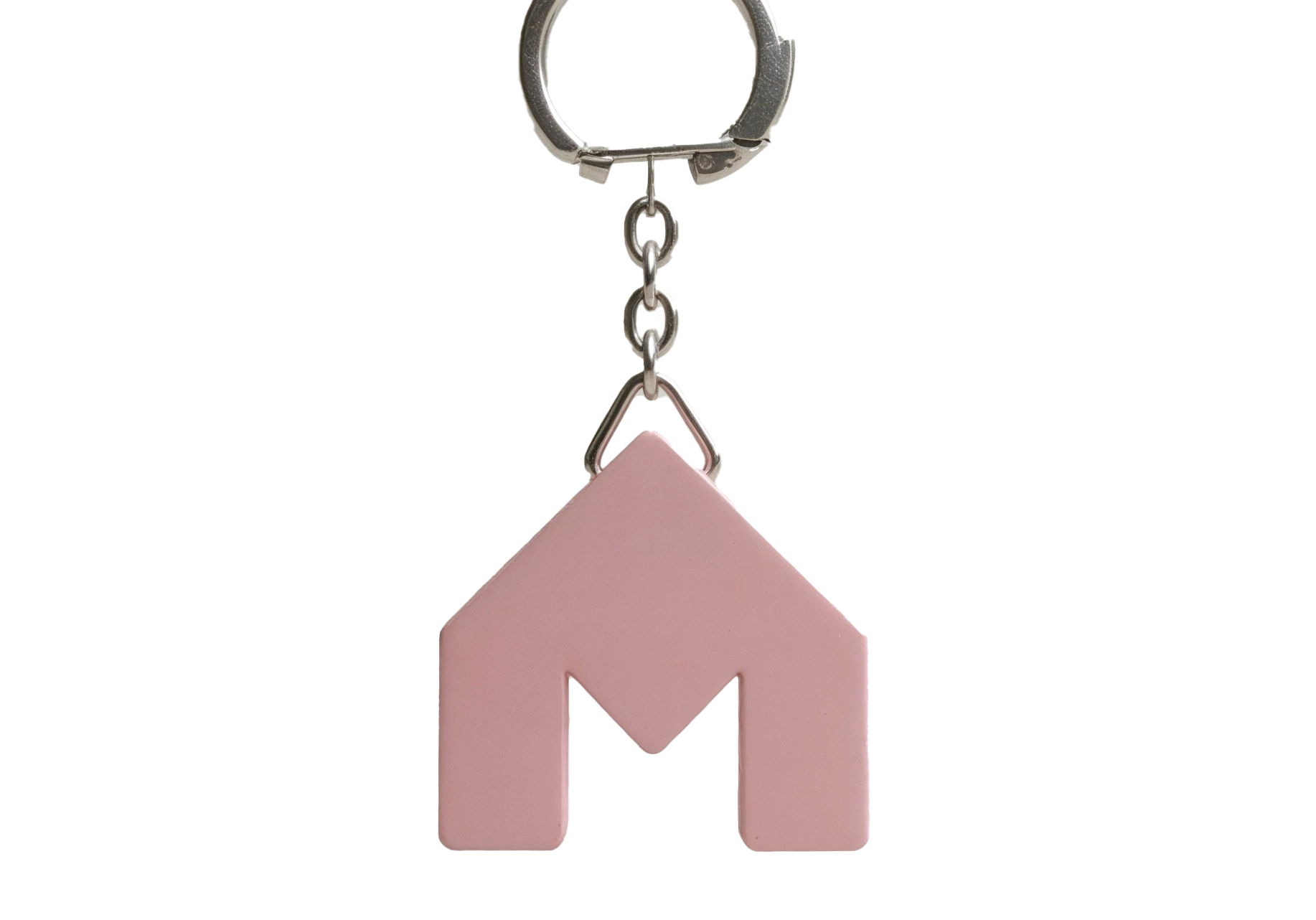
This logo doesn't aim to convey hidden meanings — it's simply a small house with the letter M inside, a straightforward symbol of entering home. Originally, this mark was created for dmbt.media, and later, as the brand evolved into dmbt.family, it carried over as a nod to its origins. The original form remained — modest, familiar and practical — while dmbt.media developed into a separate sub-brand. The house mark became a quiet link between past and present, keeping the brand's visual memory intact.