Movement through geometric consistency
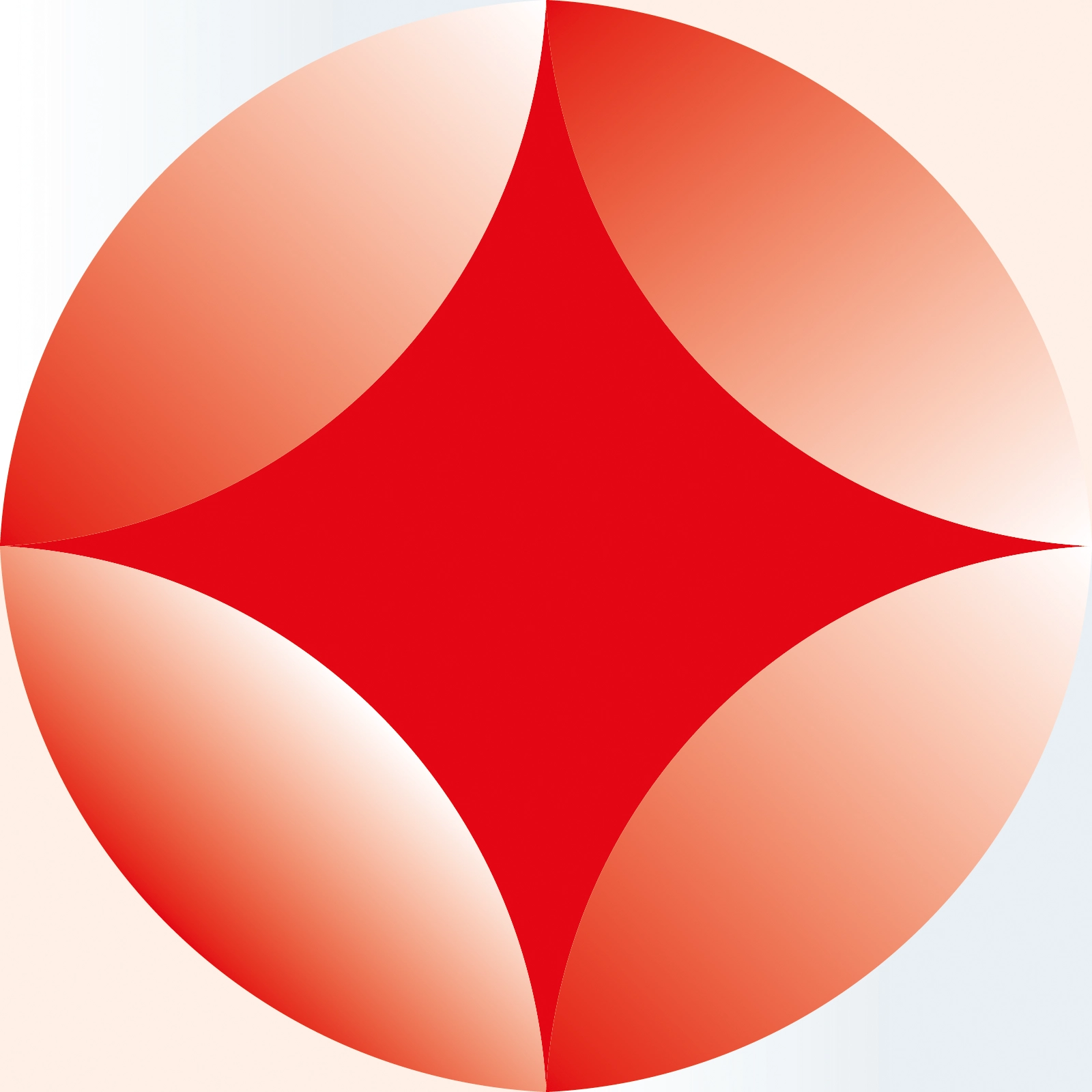
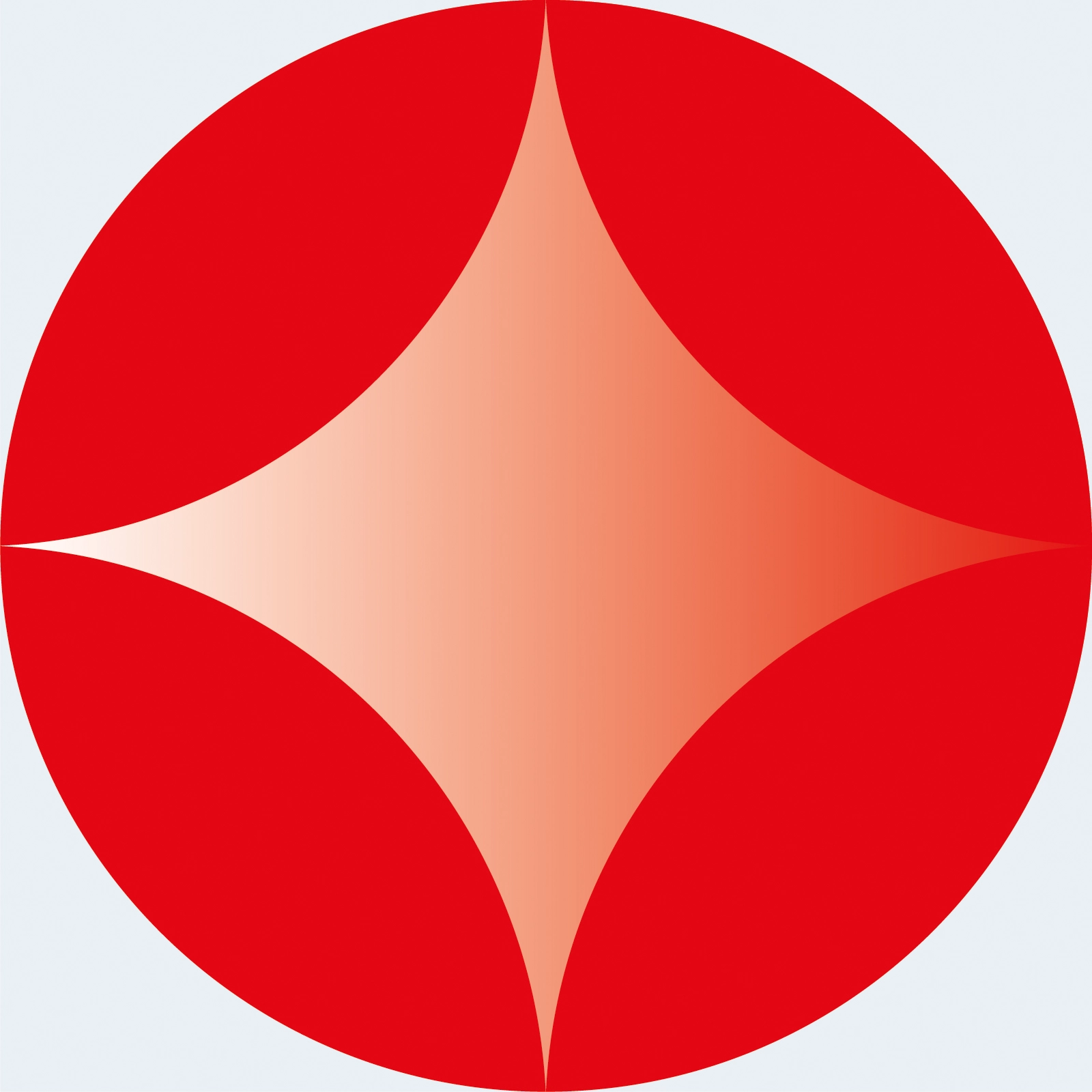
The system is built around one compact mark. Its geometry remains stable as it repeats into patterns, opens into counterforms, frames the body, changes scale and moves between the studio, apparel, print and digital communication.
The mark does not illustrate a Pilates pose. It turns movement into a consistent behaviour of the brand.
A women-focused boutique Pilates and wellness studio in the United States.
Brand strategy, concept, identity design, art direction and application system.
Connect movement, feminine semiotics and continuity through one recognisable geometry.
Logotype, pattern, photography logic, typography, colour, voice and applications.

Movement, reduced to structure
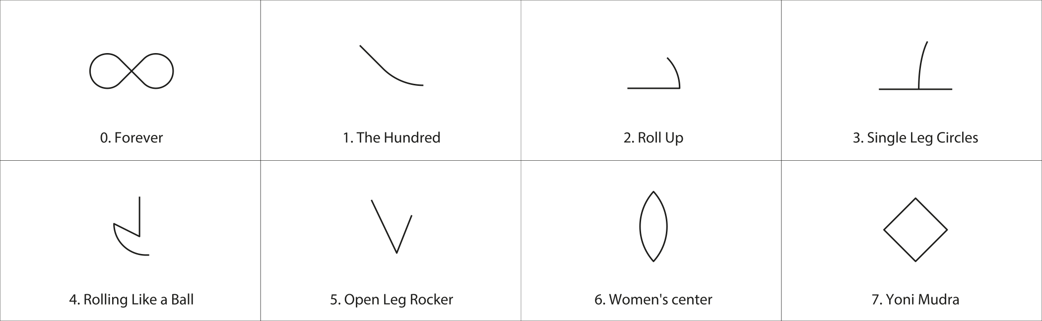
The project began with an analysis of Pilates as movement. I studied recurring curves, body anchor points, and the trajectories created as the body extends, contracts, rotates, and returns to balance. Rather than focusing on individual poses, the goal was to identify the geometric principles that remain consistent across movement.
Those principles informed the identity system. Instead of referencing a specific posture, the visual language was built on relationships that repeat throughout Pilates practice, making the identity flexible while preserving a consistent underlying structure.
Finding the geometry of movement
The final mark emerged where three different references began to share the same structure.
Infinity
I deconstructed the familiar infinity sign into base circles and intersections so it could operate as geometry rather than illustration.
The women's centre
The reference was used morphologically: a centred, petal-like form that suggests origin, concentration and inner strength.
Yoni Mudra
Its structure connected the body, the centre and a controlled opening through a gesture grounded in practice.
Designed for different contexts
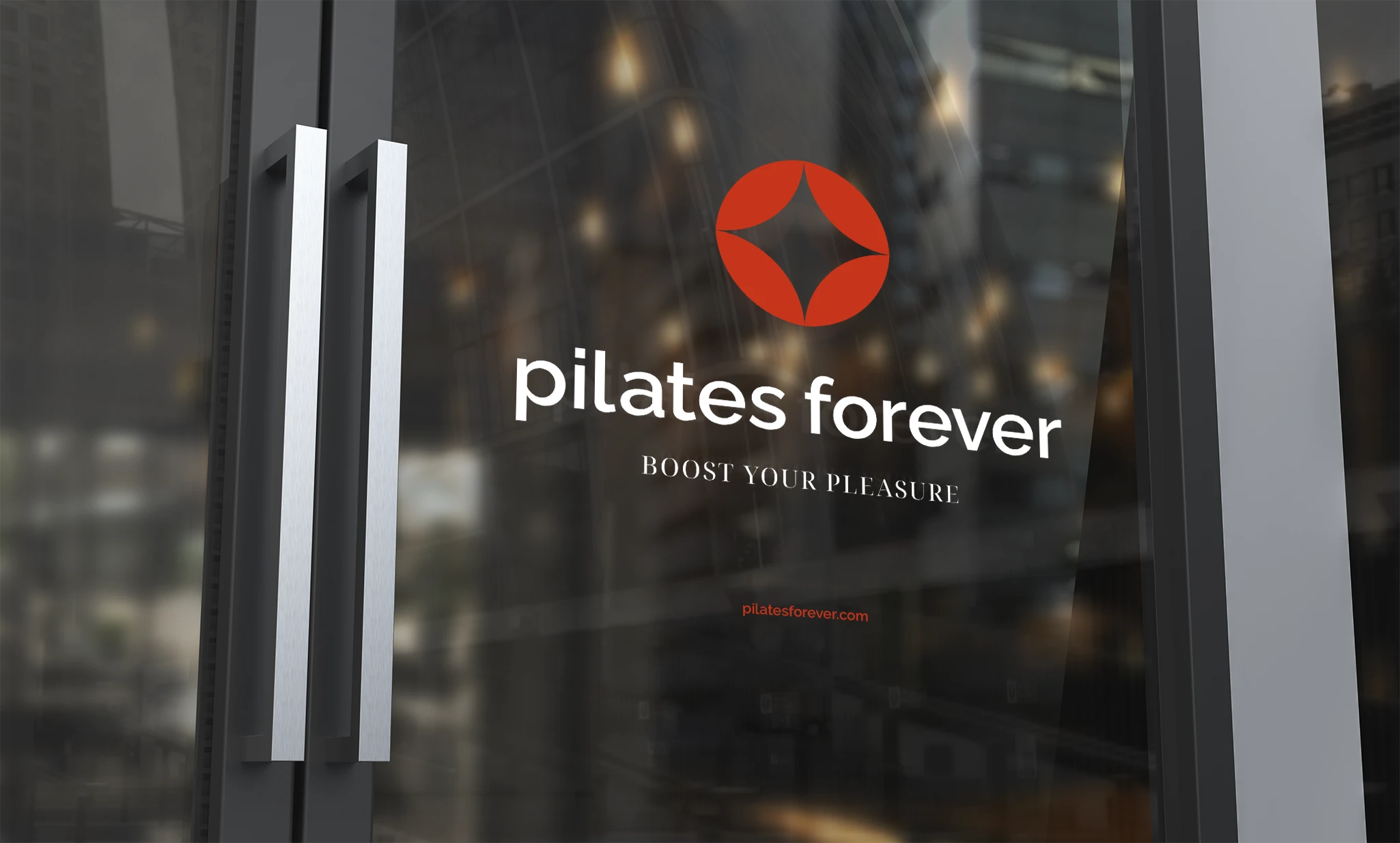
The identity uses vertical and horizontal compositions because recognition does not happen in one type of space.
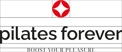

The vertical lockup creates a more centred and editorial presence. The symbol, wordmark and tagline form one descending structure for applications that require stronger focus or hierarchy.
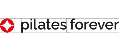

The horizontal lockup supports linear reading. The mark and wordmark share one axis, with spacing calibrated for signage, headers, printed materials and formats where width is available.
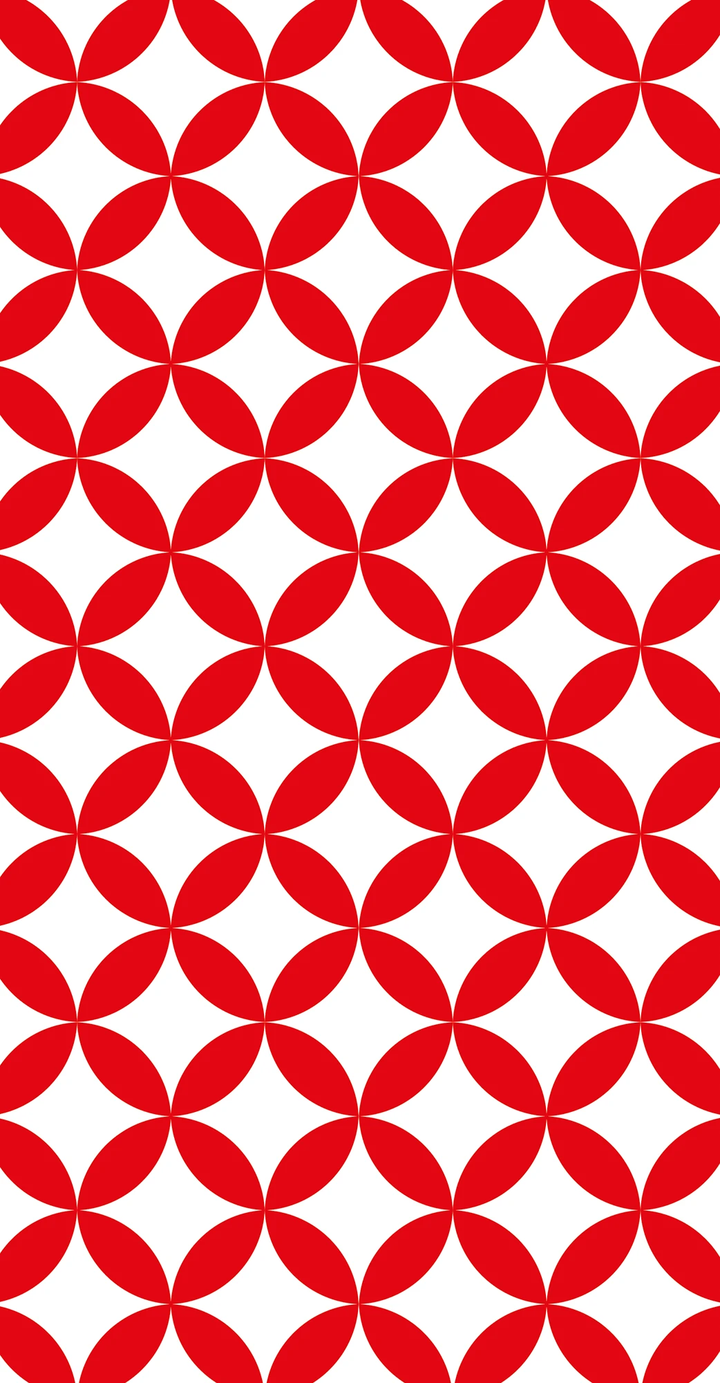
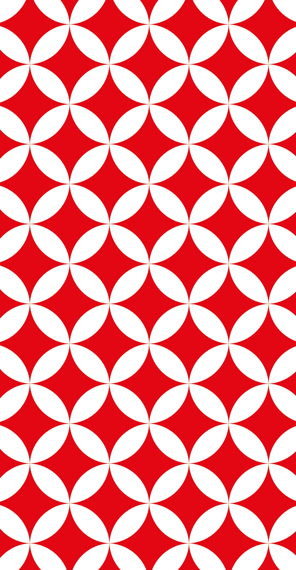
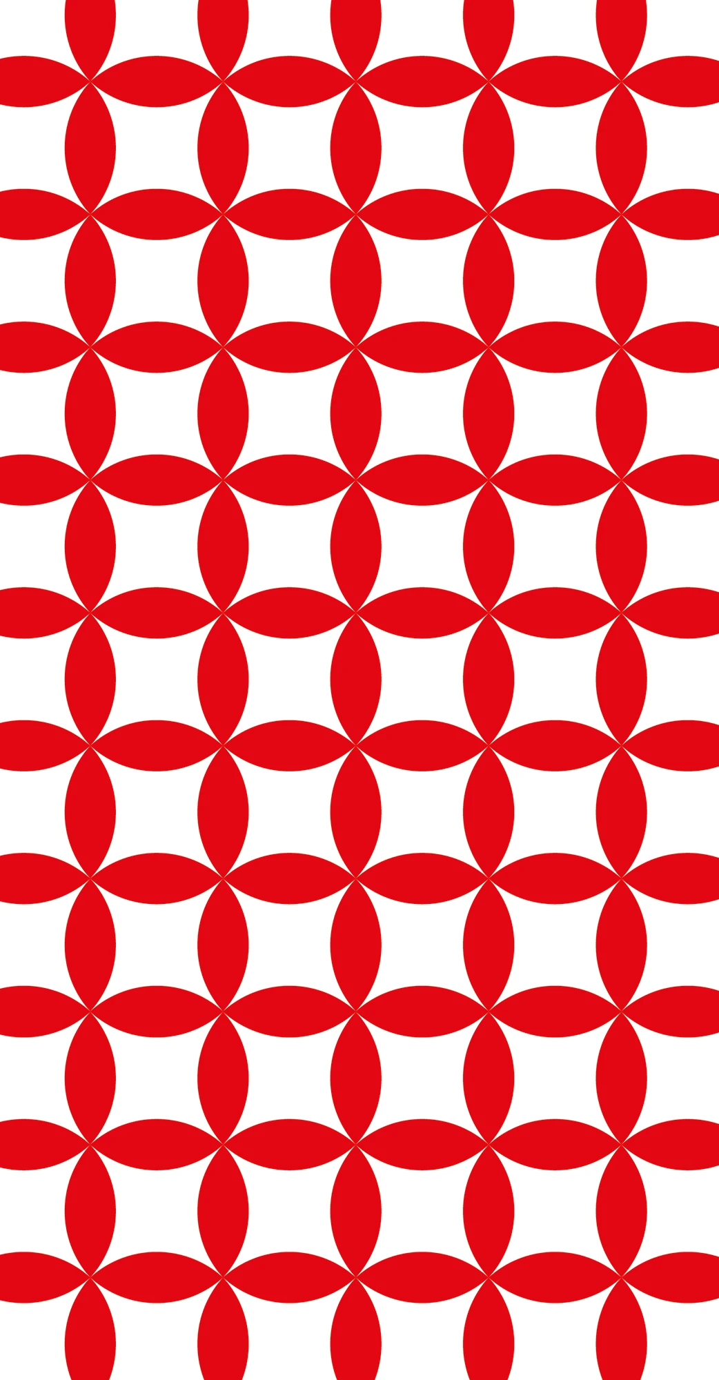
Repetition turns the mark into motion
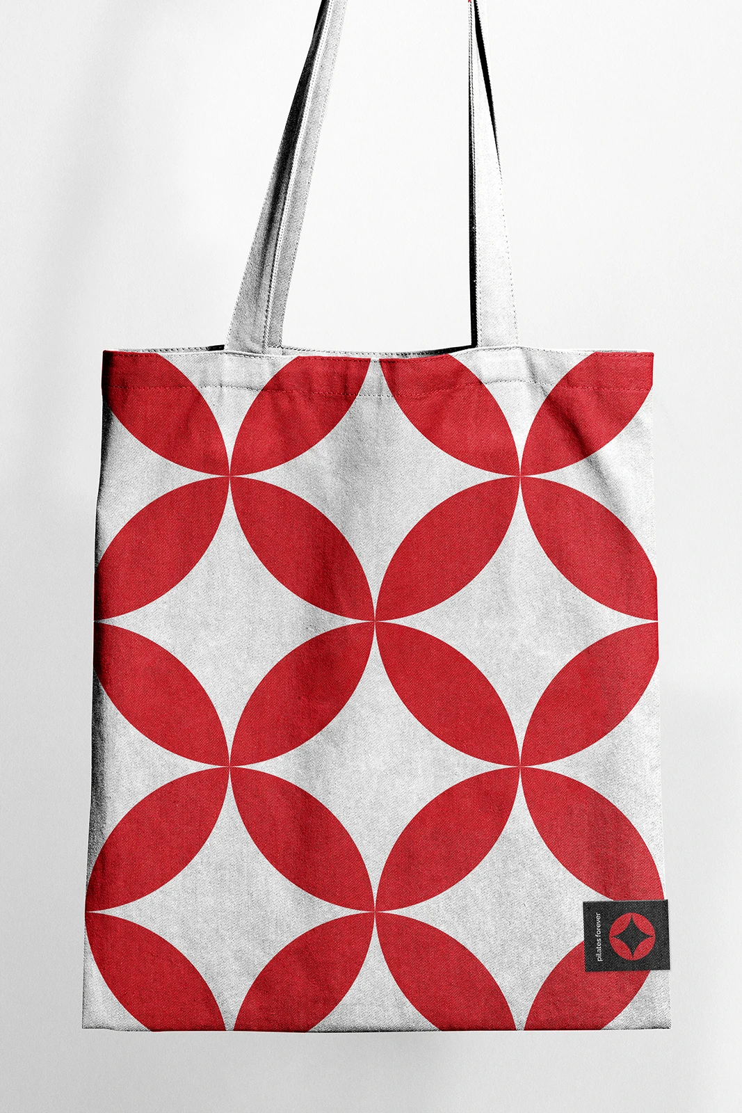
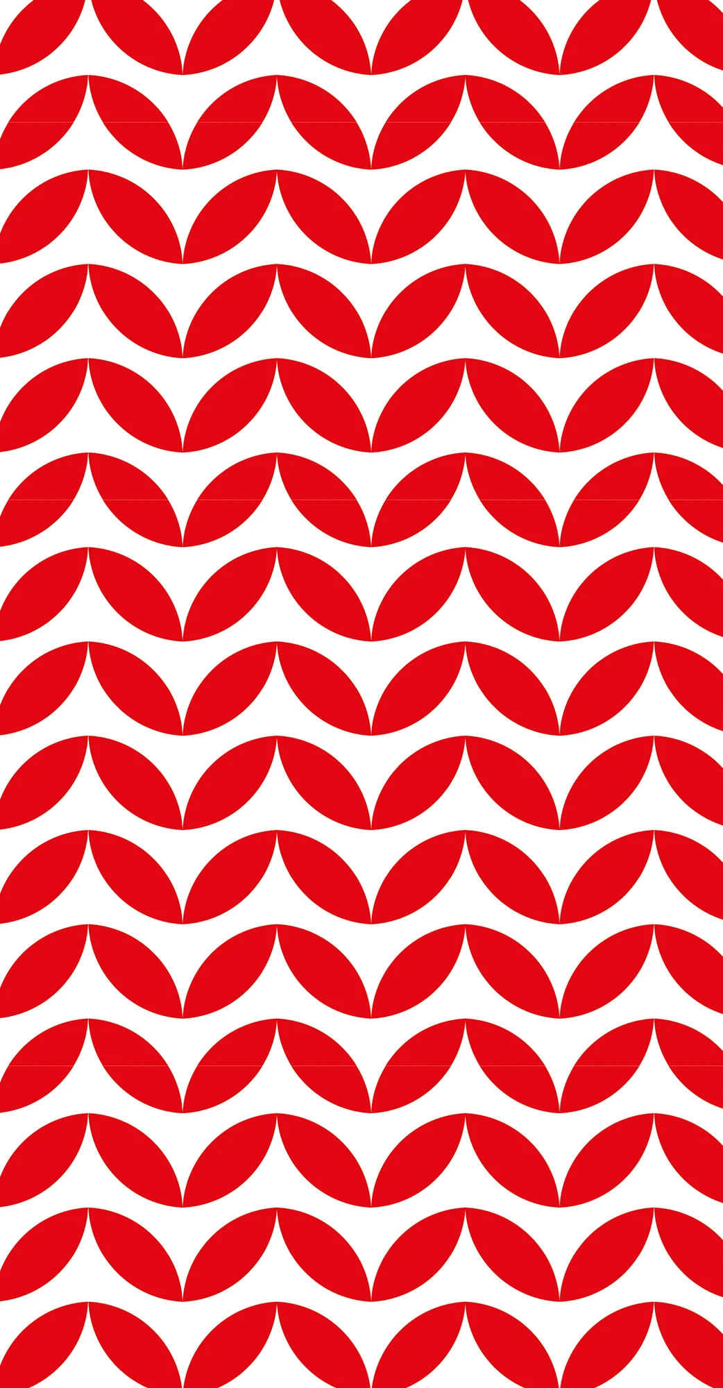
The pattern system began with the same question as the logo: how does the form behave when it moves?
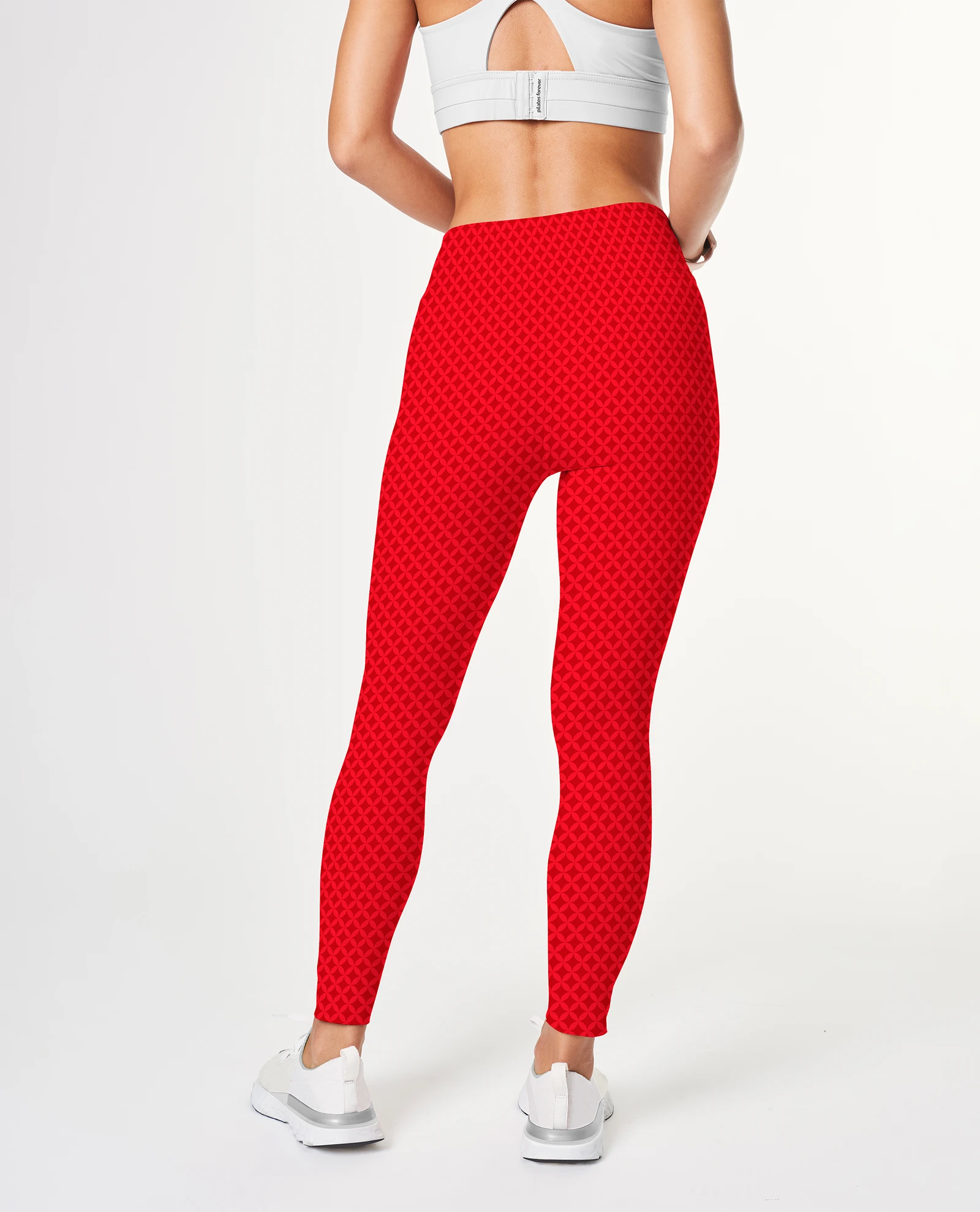
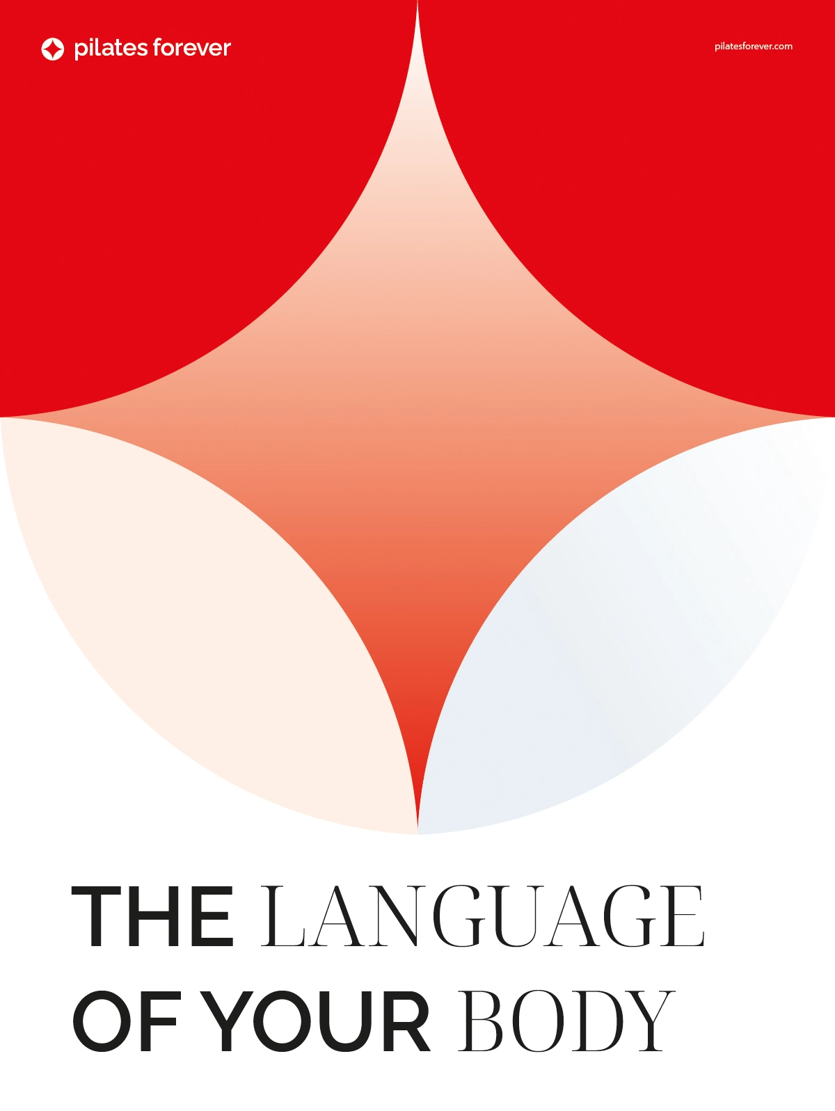
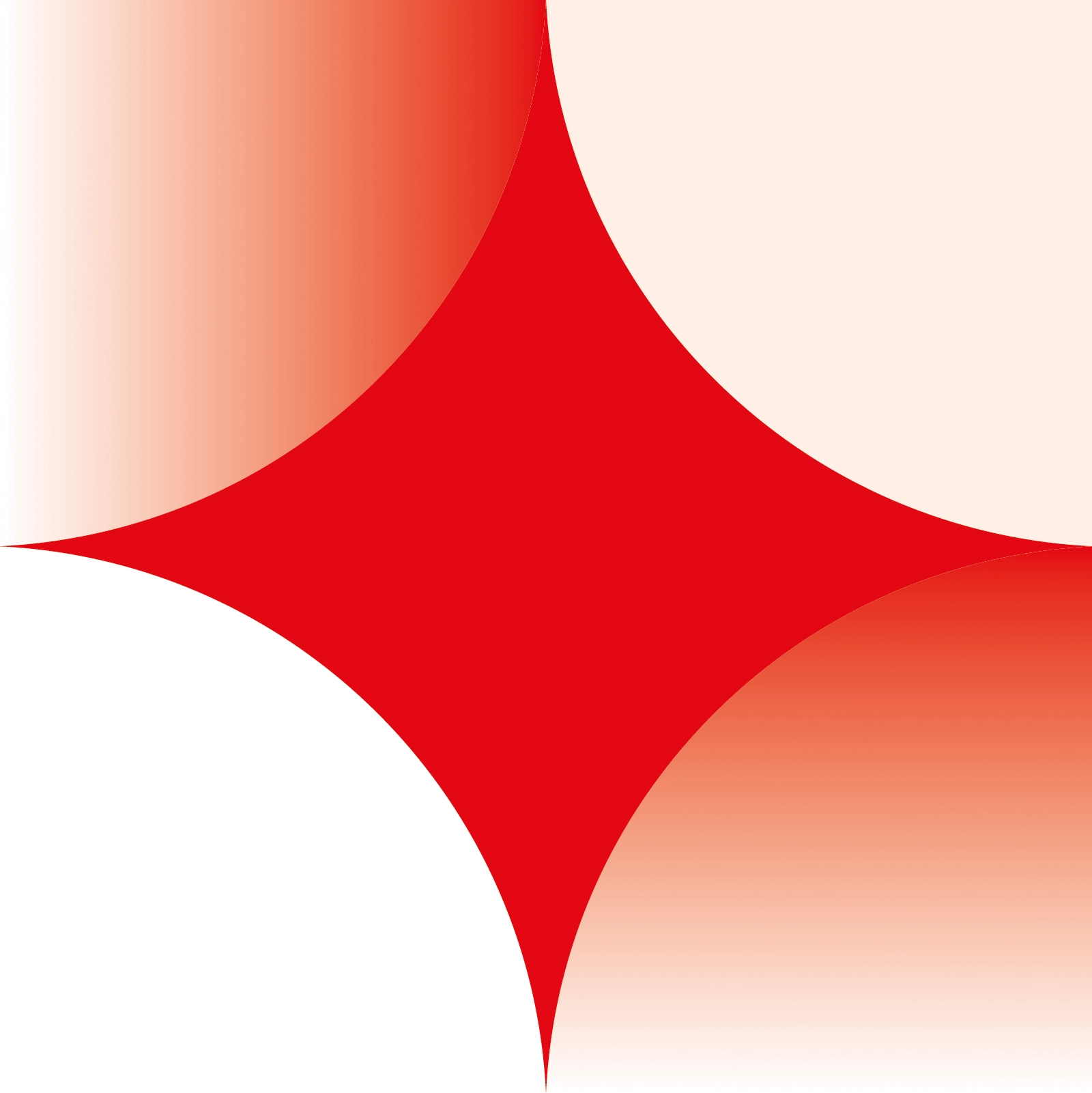
I repeated, reflected, rotated and connected the core modules. Some combinations produced dense rhythm. Others opened into softer structures. The most useful patterns retained the identity's character without becoming floral decoration or generic wellness ornament.
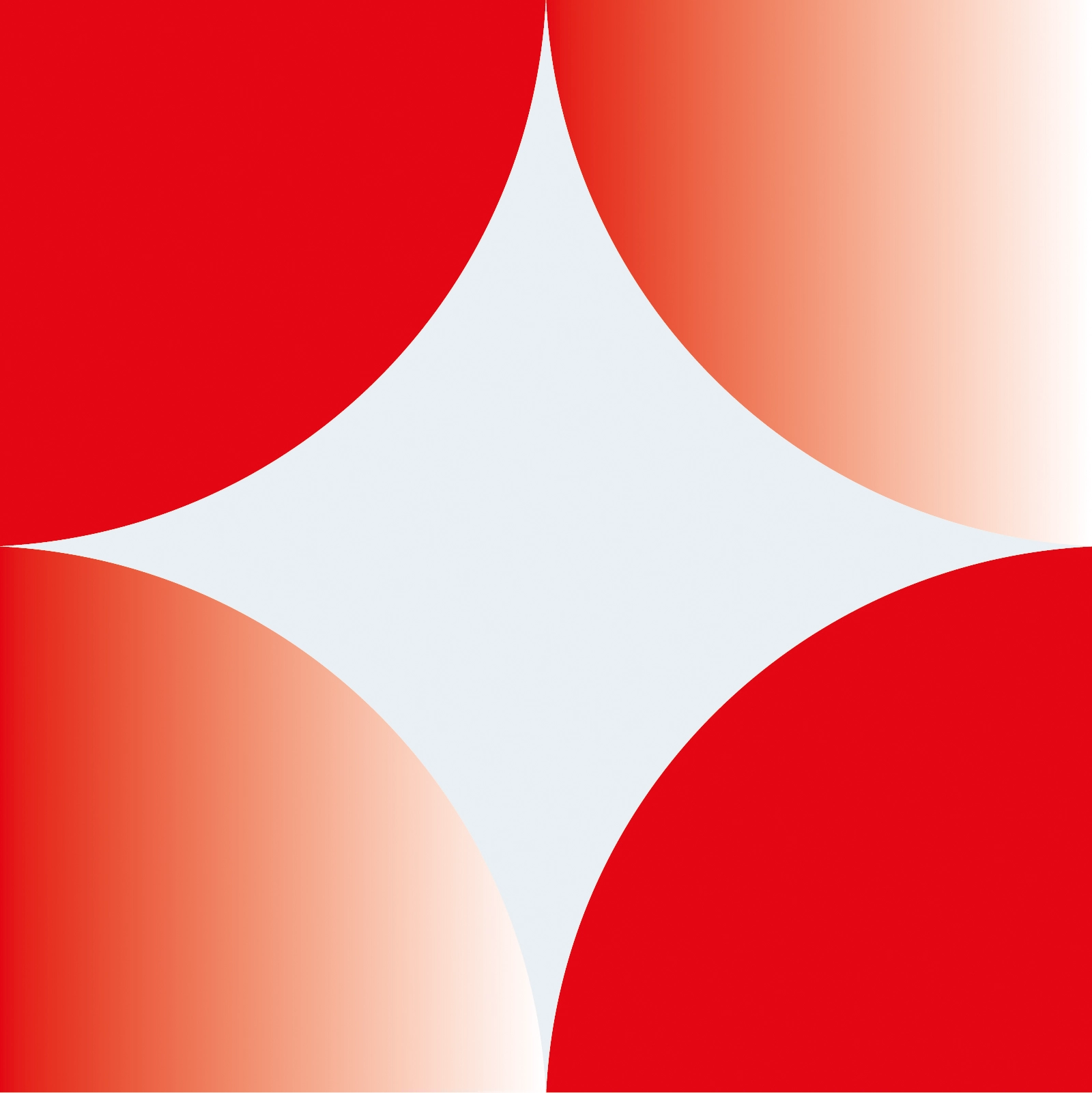
Counterform is where the system opens
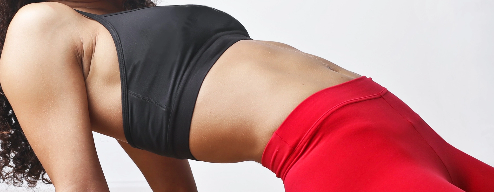
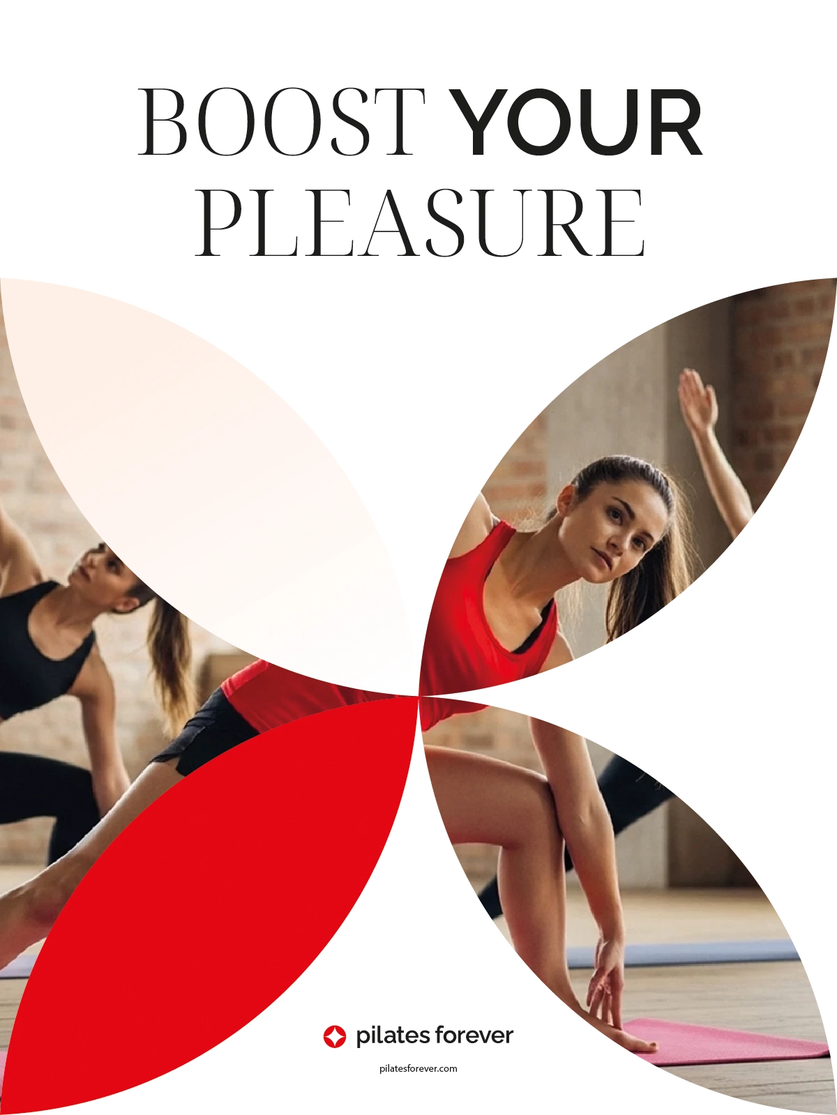
The logo's internal spaces became a functional tool.
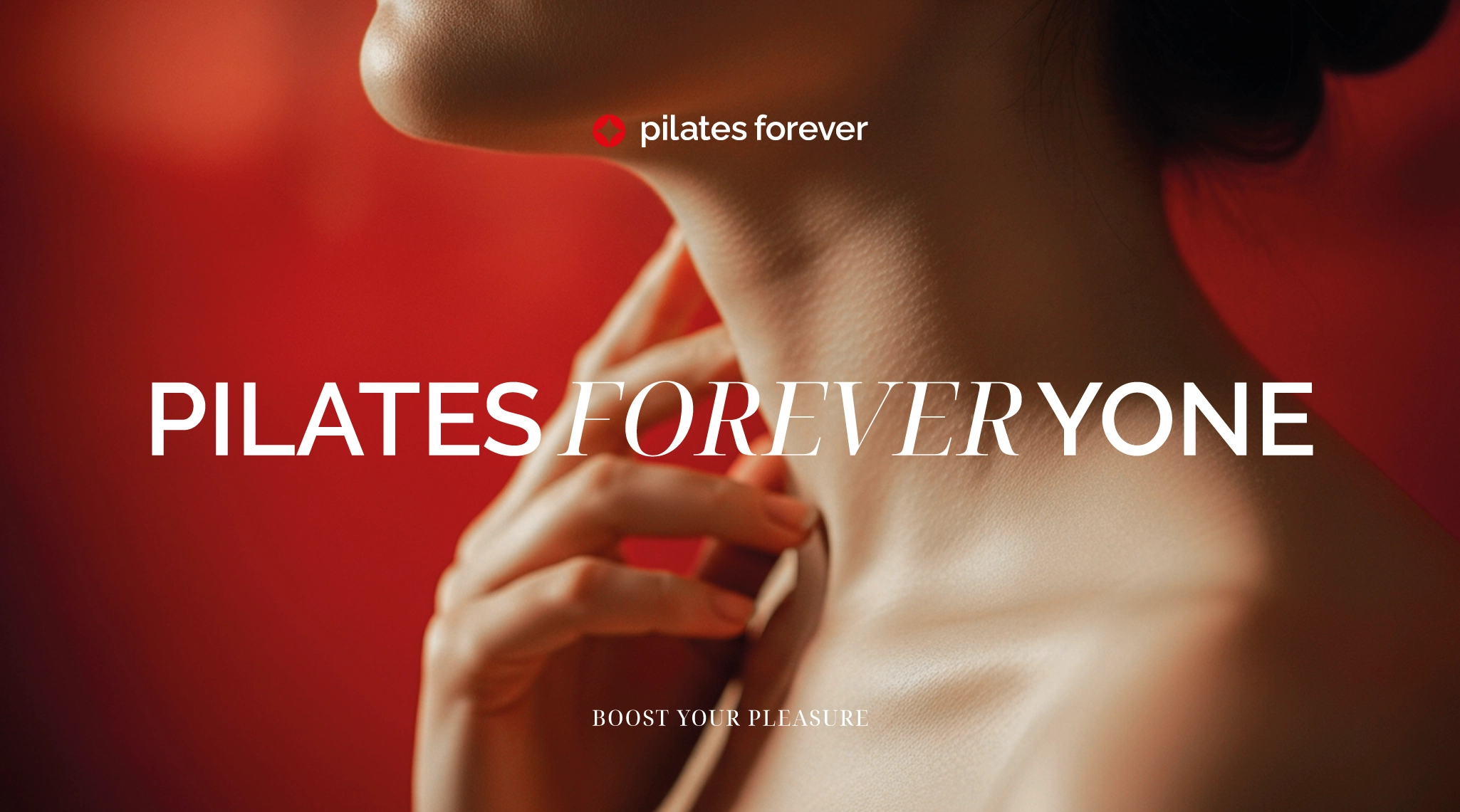
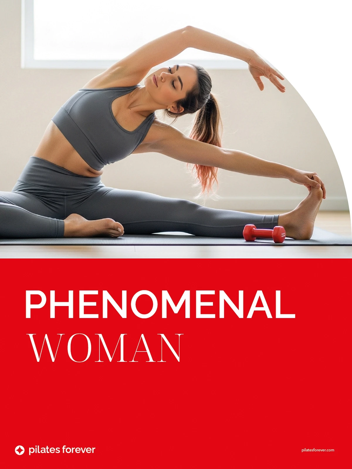
They can frame photography, isolate details, interrupt an image, direct a crop or create an accent composition. This allows the body to enter the identity without becoming generic lifestyle photography placed behind a logo.
Typography creates range without changing character
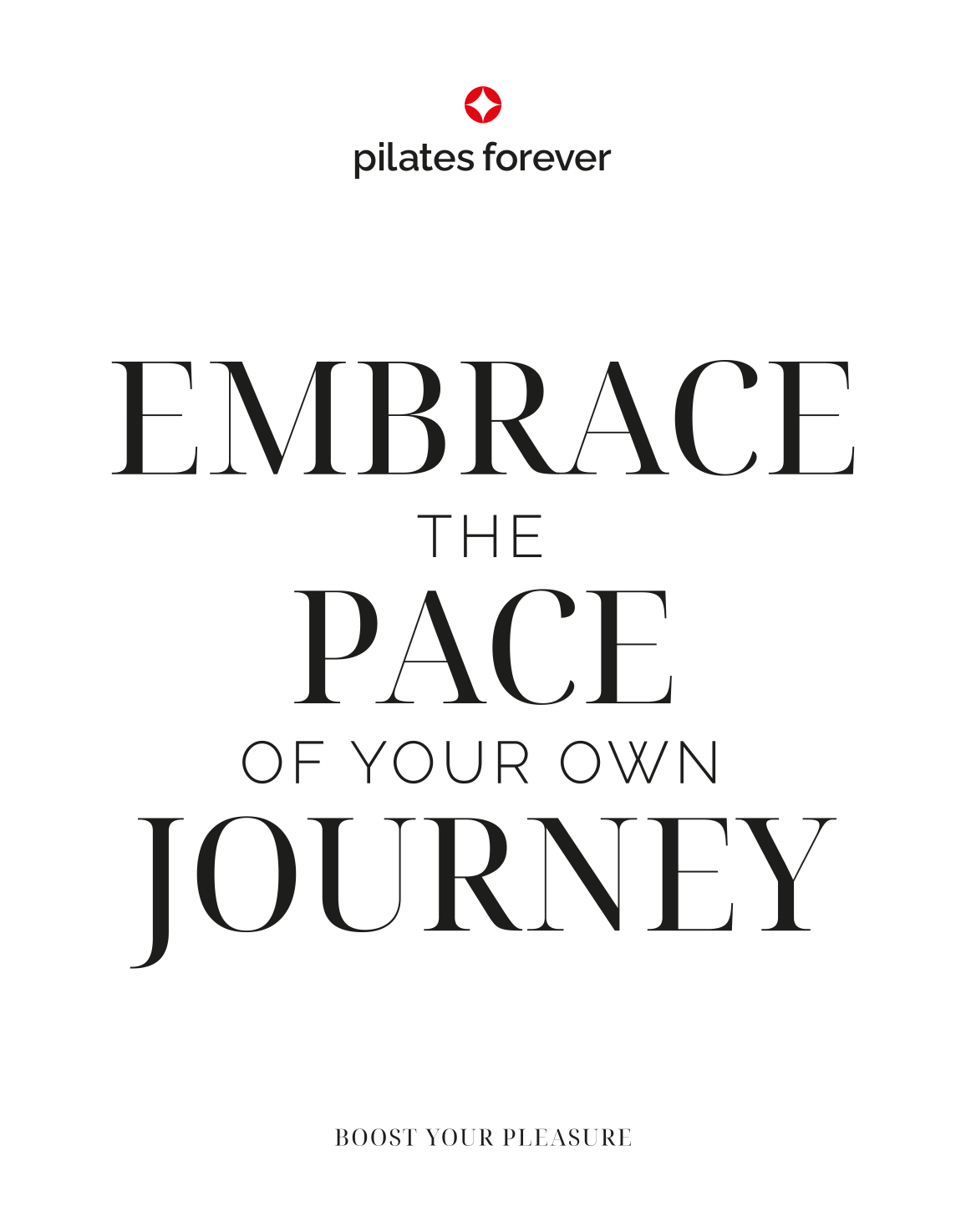
The typographic system combines a classic serif with a modern grotesk.
The serif brings warmth and an editorial tone. The grotesk provides clarity and functional control. Their roles are separated through scale, hierarchy and context, allowing the brand to move between reflective communication and practical information without sounding like two different organisations.

The identity in use
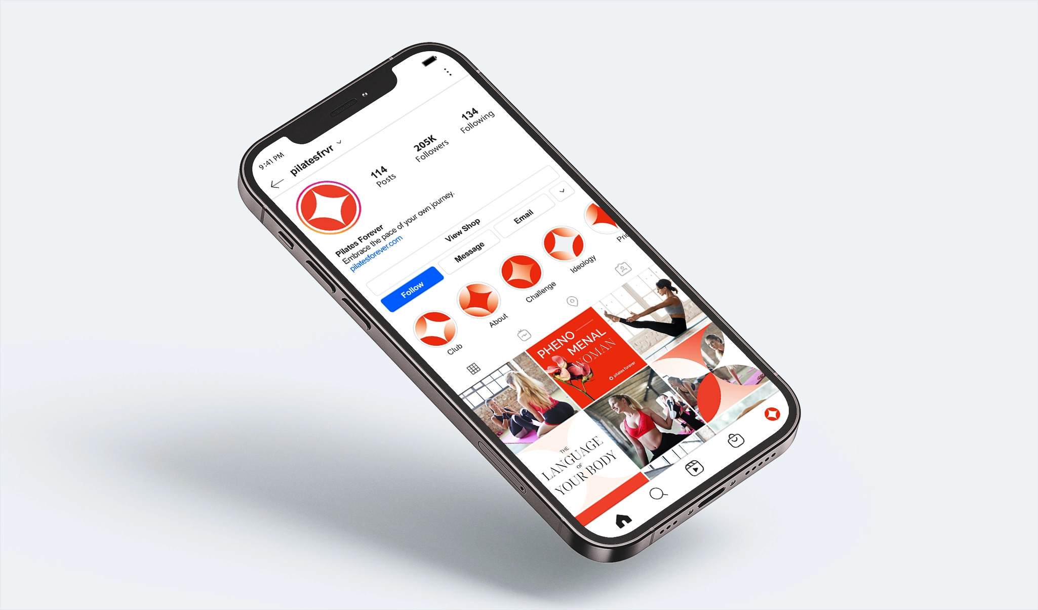
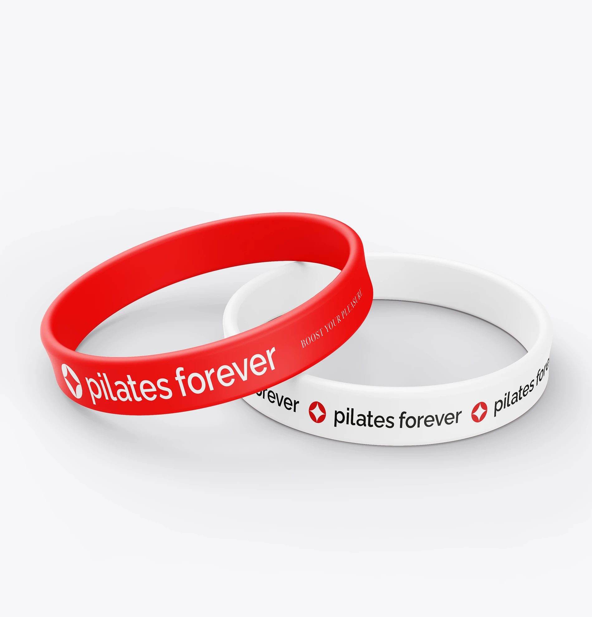
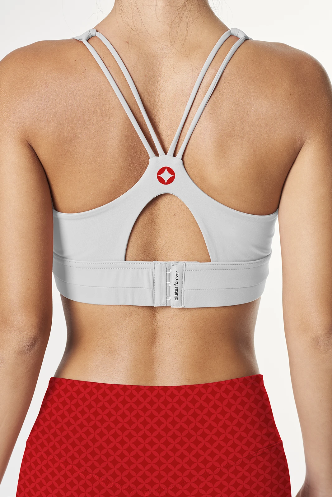
The system was tested across signage, apparel, accessories, posters, social communication, advertising and printed material.
Each application tests a different condition. Signage requires immediate recognition. Apparel requires repeatable geometry. Posters require stronger hierarchy. Small objects test reduction. Digital formats test whether the system remains coherent when dimensions change.