Designing interfaces for decisions, not data
The work focused on building a clear decision sequence inside each component: what needs to be understood first, which information can wait, how actions should be prioritised, and how the structure should respond when content becomes longer, denser or less predictable.
The components were developed for real client products and are presented here in anonymised form.
The work focused on building a clear decision sequence inside each component: what needs to be understood first, which information can wait, how actions should be prioritised, and how the structure should respond when content becomes longer, denser or less predictable.
Four anonymised interface systems developed for real client digital products.
UX/UI design, interaction logic, prototyping and design validation.
Turn dense, variable and changing information into clear decision sequences.
Responsive logic for an expert card, geography filter, live table and seminar listing.
The interface begins before the screen
Dense interfaces rarely fail because information exists. They fail because every piece of information behaves as though it deserves attention at the same moment.
My work across these four components began before visual styling. I defined the first decision, separated primary and secondary signals, and established rules for variable content, interaction states and responsive transformation. The objective was not to make every component look simpler. It was to make each component easier to understand under the pressure of real use.
Sequence before surface
A component works when information appears in the order users need to scan, compare and act without reconstructing the interface.
Rules before ideal content
A component is resolved when it can absorb long names, changing values, empty states and imperfect input without requiring additional effort from the user.
Responsive logic before compression
A component may change its geometry across viewports, but it must preserve the same priorities, decision model and path to action.
A profile card is not a profile
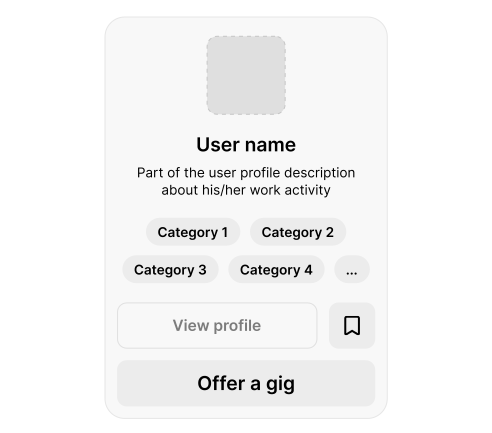
In a repeated expert listing, the card has one job: help someone decide whether this person is relevant enough to explore or contact.
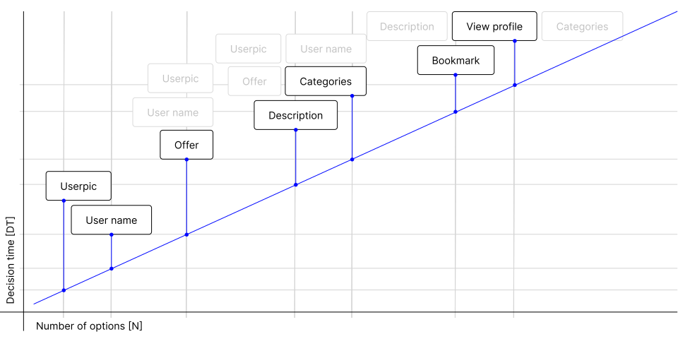
The initial content model asked the card to perform too many roles at once. Identity, categories, biography, profile access, saving and direct contact competed inside a compact surface. The more complete the card became, the slower comparison became.
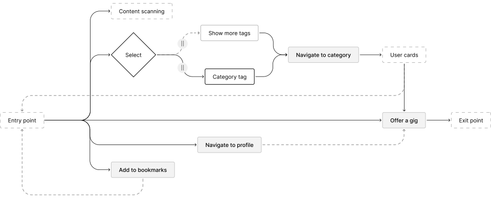
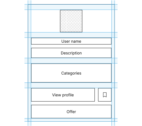
I treated the component as a threshold rather than a compressed profile page. Identity remains immediate. A reduced set of relevance signals supports comparison. Secondary controls stay available without taking over the surface, while Offer a gig holds a stable position as the primary action.
Information scent
Show only the signals needed to judge whether the expert is relevant.
Progressive disclosure
Keep deeper profile information available without placing it all on the card.
Action hierarchy
Make Offer a gig the clearest action while keeping secondary options accessible.
Across rapid-selection scenarios, the strongest versions were not the ones with the most information. They were the ones in which the first uncertainty could be resolved without decoding a new layout on every card.
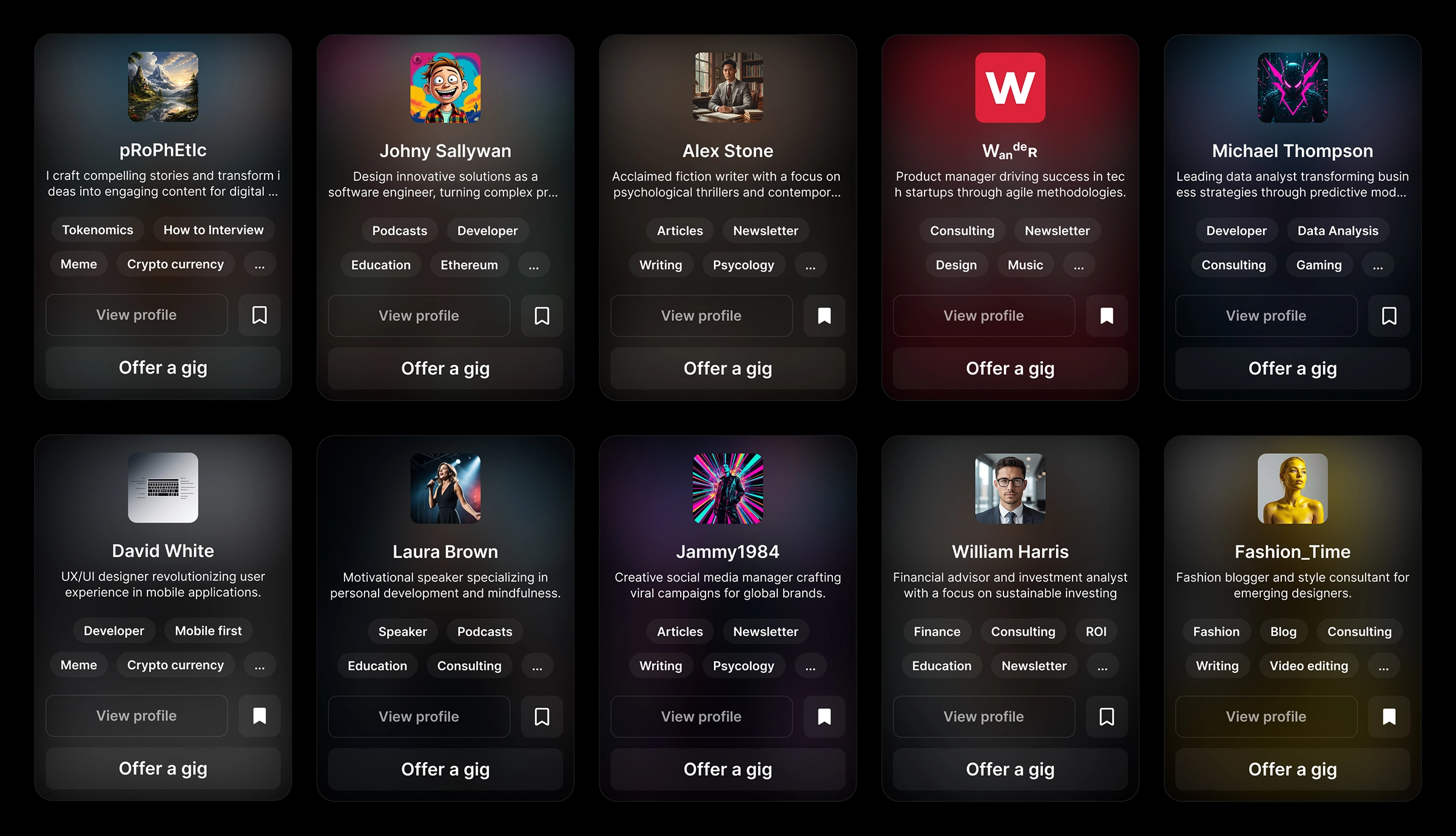
A useful card does not attempt to show everything. It resolves the first uncertainty well enough for the next decision to happen. Its visual hierarchy is designed for scanability at scale, allowing users to identify, compare and distinguish relevant options even within a field of twenty or thirty cards.
Making hierarchical data searchable in natural language
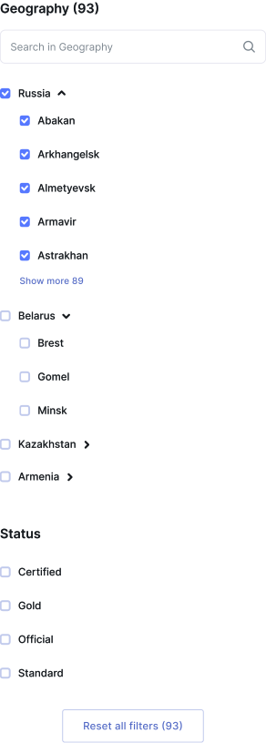
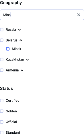
A geographic database has a clean structure: country, region, city. Human input arrives differently. Someone may type a full place name, a partial word, the beginning of several words, a misspelling or a broader territory when they are not yet sure what they need.
The design challenge was to return accurate results from partial, informal queries within a hierarchical data structure.
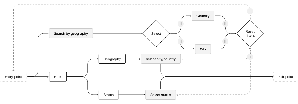
I connected search, hierarchy and feedback as one adaptive interaction. Relevant levels appear progressively. Matching supports partial and imperfect input. Result counts respond to the current query and selection state. When the system is uncertain, it proposes a way forward without turning exploration into an error state.
Faceted navigation
Organise countries, regions and cities as connected levels of one filter.
Progressive disclosure
Reveal only the part of the hierarchy that is relevant to the current search.
Error-tolerant search
Support partial input, misspellings and uncertain queries without interrupting the user.
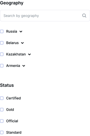
Desktop and mobile use the same information model but not the same physical behaviour. A constrained desktop panel can contain an internal scroll area. On mobile, the hierarchy should expand through the page rather than create a smaller scrollable interface inside the viewport.
The filter takes on most of the work behind the search: interpreting spelling errors, semantic variations and incomplete queries, narrowing a large hierarchical dataset and continuously updating results. This reduces the cognitive load on the user, even when they cannot name the exact location or are still working out what they need.
Keeping changing table data easy to scan and compare
A live table sits between two opposing conditions. Its values update, but the interface must remain stable enough for users to compare rows without relearning how the table works.
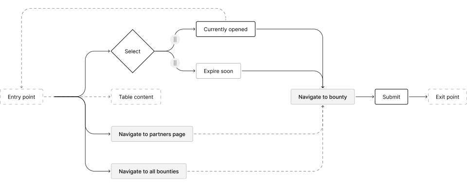
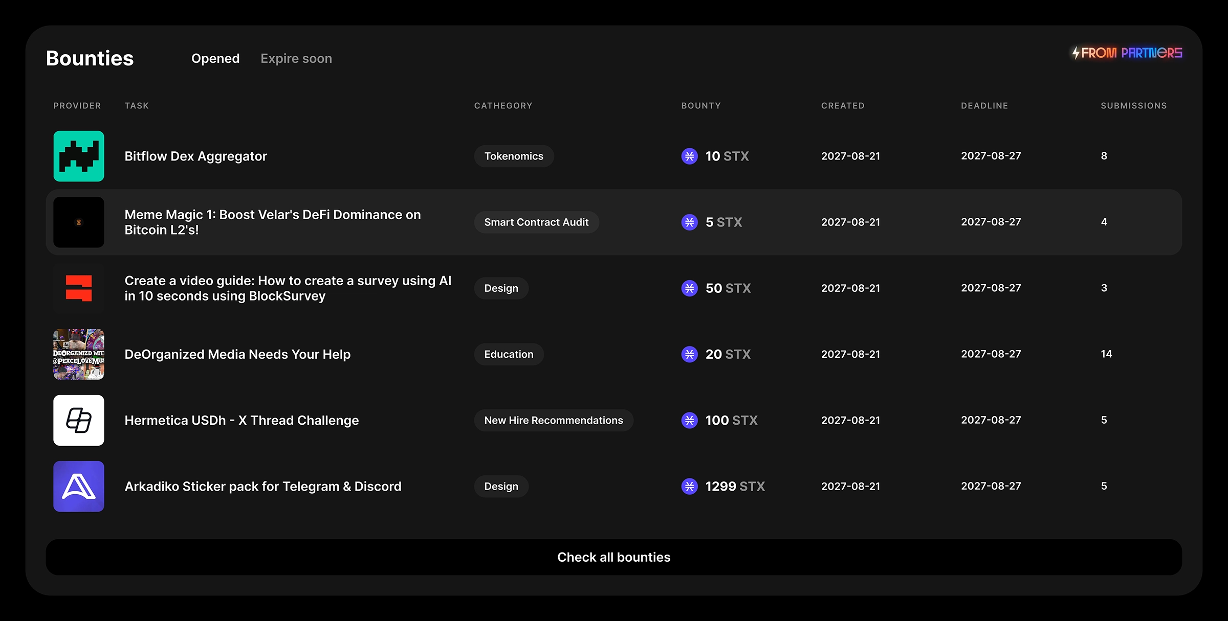
The homepage component had to surface provider, opportunity, category, bounty, creation date, deadline and submission activity. Every field could vary. One unusually long title, a different currency format or a sudden live update could disturb the entire reading rhythm.
I defined the row around the sequence of comparison rather than the order of the database fields. Variable values received explicit formatting and truncation rules. Secondary information moved to the next level. Live updates could change the content without changing the way the row was read.
Situation awareness
Keep the task, source and current status easy to recognise as the data changes.
Information normalisation
Use consistent rules for titles, values, dates and activity across every row.
Details on demand
Show enough information for comparison and leave deeper context inside the full task.
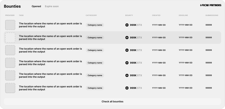
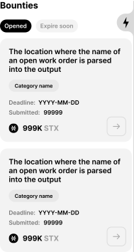
Real-time data can change continuously while the table preserves the visual anchors users rely on to read it: fixed column roles, consistent alignment, controlled row density and restrained status signals. This structure emerged from testing how people scan, compare and return to changing values.
Making complete information easier to navigate
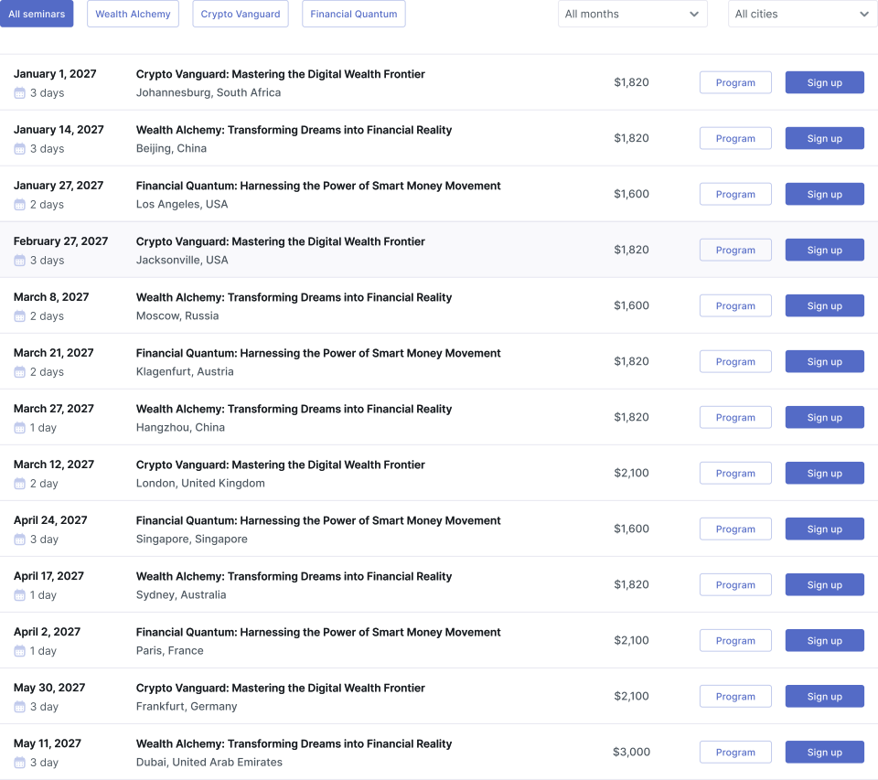
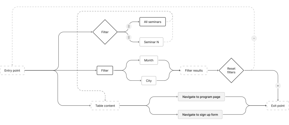
The seminar card brings the date, duration, title, location, price, programme and registration into a consistent structure, keeping essential information easy to scan and the path to registration visible across a catalogue of up to one hundred active seminars.
Every field genuinely matters and none can simply disappear. The problem arises when all information receives equal emphasis or changes position between records, making seminars slower to scan and more difficult to compare.
I assigned each field a stable role. Date and location establish practical fit. The title establishes relevance. Duration and price support comparison. Register remains the primary action, while View programme supports the reader who needs more detail before committing.
On desktop, repeated field positions create a horizontal scanning rhythm. On mobile, the same decision model becomes a vertical record. The geometry changes; the order of interpretation does not.
Information hierarchy
Place timing, location and relevance in the order users need them.
Consistent mapping
Keep the same information in the same position across every seminar.
Progressive commitment
Separate programme review from the final registration action.
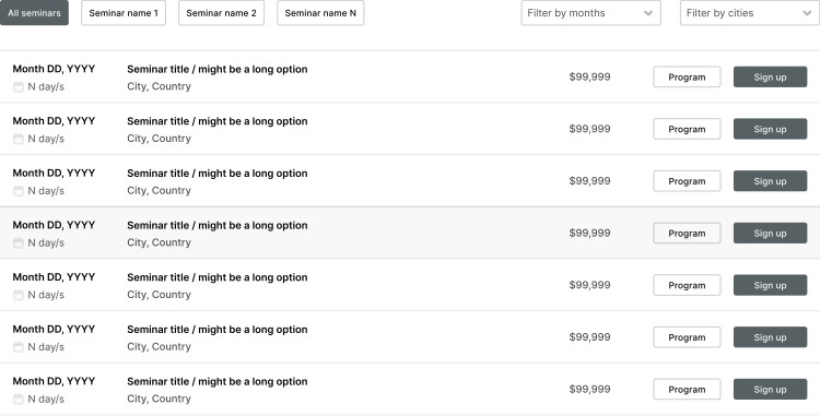

A complete seminar record does not have to feel dense or slow to navigate. When each field has a stable position and a clear level of emphasis, users can scan a catalogue of up to one hundred seminars, compare the details that influence their choice and move from initial interest to the full programme or registration.